A Practical Guide to Accessibility in Web Design

Sidharth Nayyar
TLDR: In a nutshell, web accessibility is about making sure websites and online tools are designed so that people with disabilities can use them. It's not some optional extra; it’s the bedrock of creating genuinely inclusive online experiences. This means your site needs to play nice with screen readers, be fully usable with just a keyboard, and offer text alternatives for all your images.
Your Quick Guide to Web Accessibility
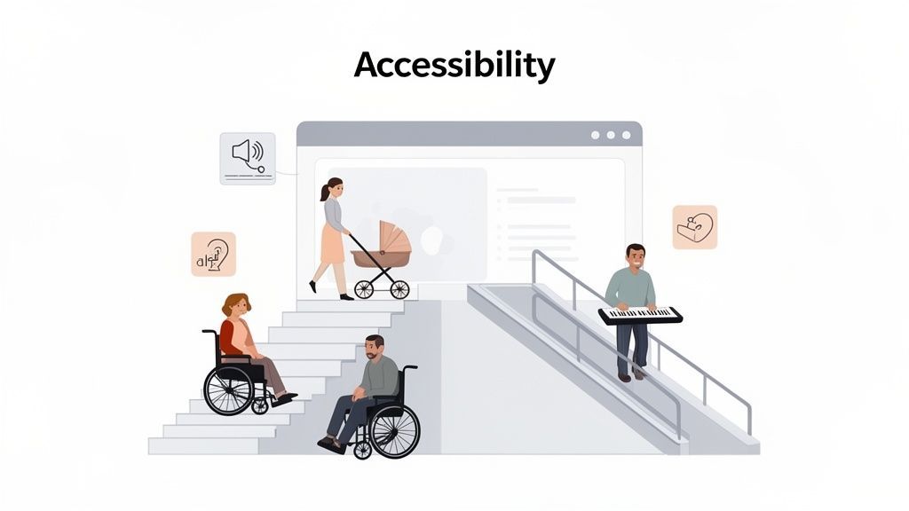
Think of it this way: just as a physical building needs ramps alongside stairs, your website needs digital ramps to give everyone a way in. Solid accessibility in web design isn’t just about ticking a box to avoid legal trouble—it's a massive part of creating a great user experience for everyone.
Following established standards, like the Web Content Accessibility Guidelines (WCAG), is the best way to get there. Doing so doesn't just reduce your legal risks under laws like the Americans with Disabilities Act (ADA); it also opens up some pretty significant business benefits.
At the end of the day, an accessible website is a more usable website for every single visitor. It grows your potential audience, strengthens your brand's image, and shows you actually care about inclusivity. When you make accessibility a priority, you're investing in a better, more open web for all of us.
Why Accessibility in Web Design Matters More Than Ever
Let's move past the textbook definitions for a moment. Think about a physical store with a grand staircase but no ramp or elevator. It might look impressive, but it instantly tells customers with wheelchairs, parents pushing strollers, or even delivery drivers with dollies, "You're not welcome here."
An inaccessible website does the exact same thing in the digital world. It puts up a "Closed" sign for a huge number of potential users.
This isn't some niche issue affecting only a small group. Accessibility in web design is really about universal design—creating experiences that work better for everyone, regardless of their situation.
It’s Not Just About Permanent Disabilities
When we design with accessibility in mind, we’re actually accommodating a massive spectrum of human experiences, many of which are temporary or situational.
Think about the real-world scenarios your users are in:
Temporary Impairments: The person with a broken arm trying to navigate your site using only their keyboard.
Situational Limitations: The new parent holding a sleeping baby, forced to browse one-handed.
Environmental Factors: Anyone trying to read your website on their phone in bright sunlight, who suddenly needs high-contrast text.
When you solve for these needs, you create a more robust and forgiving experience for every single person who visits your site. It’s not just a nice thing to do; it’s a smarter way to design.
The Massive, Untapped Market You're Ignoring
Ignoring accessibility isn't just a design flaw—it's a massive business blunder. Companies are actively leaving money on the table by shutting out a loyal and significant customer base.
Inclusivity isn't a cost center; it's a growth strategy. Committing to accessibility opens up new revenue streams, builds incredible brand loyalty, and shows you actually care about serving all of your customers.
The numbers are staggering. By embracing accessibility, businesses globally can tap into a market with a combined spending power of $13 trillion. You can dig into more of the economic data on web accessibility to see just how big the opportunity is.
This isn't just a statistic; it's a clear path to revenue and a powerful way to differentiate your brand. An accessible website is one of the strongest signals you can send that your business is truly open to everyone.
At its heart, web accessibility is simply about making sure everyone can use your website. It's not a fringe "nice-to-have" feature; it's the fundamental practice of building websites and online tools that people with disabilities can perceive, navigate, and interact with effectively.
This means building a site that works seamlessly with screen readers, is fully controllable with a keyboard, and provides meaningful text alternatives for all your images. In short, it’s about creating genuinely inclusive online experiences.
What is WCAG and Why Does It Matter?
Diving into accessibility in web design can feel overwhelming at first, almost like you’ve been handed a dense technical manual. But the good news is that the global standard—the Web Content Accessibility Guidelines (WCAG)—is built on a foundation that's surprisingly straightforward.
It’s best to think of WCAG not as a restrictive checklist, but as a set of core principles designed to make the web a better, more functional place for all of us. These principles are neatly organized into an acronym you’ll want to remember: POUR.
Let's break down what each of these principles means in the real world.
The table below outlines the four core pillars of WCAG, explaining what each means for your users and showing what it looks like in practice.
The Four Principles of WCAG (POUR) Explained
| Principle | What It Means for Users | Example in Practice |
|---|---|---|
| Perceivable | All users must be able to perceive the information being presented. It can’t be invisible to their senses. | Providing descriptive alt text for an image allows a screen reader to describe the visual content to someone who is blind. |
| Operable | The interface and navigation must be usable. It shouldn’t require an interaction a user can’t perform. | Ensuring every button, link, and menu can be accessed using only the Tab and Enter keys for users who cannot operate a mouse. |
| Understandable | The information and the operation of the user interface must be easy to understand. | Using clear, simple language and providing helpful error messages on a contact form that guide the user to fix a mistake. |
| Robust | Content must be able to be interpreted reliably by a wide variety of user agents, including assistive technologies. | Writing clean, standards-compliant HTML so that a website works correctly across different browsers, screen readers, and future technologies. |
These four principles work together to create a framework that, when followed, results in digital experiences that are not only compliant but truly user-friendly for people with a wide range of abilities.
Perceivable: Making Content Available to the Senses
The first pillar, Perceivable, is all about information. If users can't see, hear, or otherwise sense the content on your page, then nothing else matters. It has to be presented in a way they can process.
Take someone who is blind, for instance. They rely on a screen reader to browse the web. If you have a critical chart or an informative photo on your site, it’s completely invisible to them unless you provide a text-based alternative. That’s where descriptive alt text comes in—it gives the screen reader a script to read aloud, turning visual information into audible information.
As this graphic shows, the solutions we build for one group often create a better experience for many others, covering permanent, temporary, and situational needs.
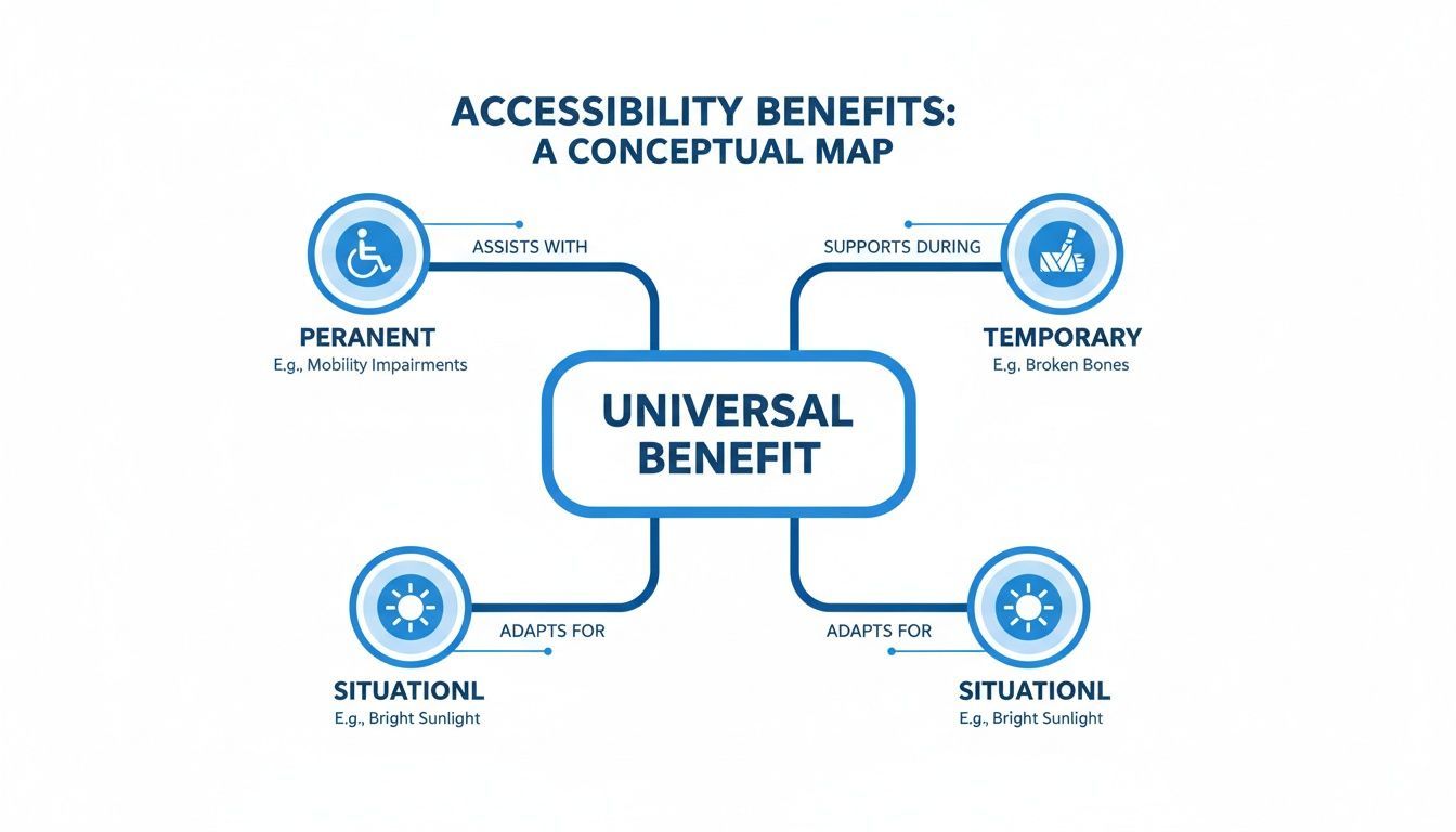
A video with captions, for example, helps someone who is deaf (permanent), someone with an ear infection (temporary), and someone watching in a noisy office (situational).
Operable: Ensuring Everyone Can Navigate
Next, we have Operable. This principle is about control. Can users actually interact with all your site's features? Your website can't demand an action that a user is physically unable to perform.
Keyboard navigation is the classic example here. Many users with motor disabilities can't use a mouse, so they rely entirely on their keyboard or other specialized input devices. An operable site allows them to tab through every single link, fill out every form field, and activate every button without ever touching a mouse.
Understandable: Making Information Clear and Predictable
The third principle, Understandable, is all about clarity and consistency. The content on your site and the way it functions shouldn't be confusing or behave in unexpected ways.
This covers everything from writing in plain language to designing forms with crystal-clear instructions and helpful error messages. To learn more about this, it’s worth understanding the relevant form accessibility standards. When someone makes a mistake filling out a form, an understandable website doesn't just show a red box; it explains what went wrong and how to fix it, heading off frustration before it starts.
By making your content predictable and easy to follow, you're not just helping users with cognitive disabilities. You're also improving the experience for someone who is distracted, in a hurry, or simply new to your website.
Robust: Ensuring Compatibility Now and in the Future
Finally, Robust ensures your content can be reliably interpreted by a huge range of technologies, especially assistive ones. As browsers and devices evolve, your content needs to keep working.
This is definitely the most technical of the four principles, as it largely comes down to writing clean, standards-compliant code. A robust website plays nicely with different browsers, operating systems, and screen readers without glitches or bugs. It’s really about future-proofing your accessibility efforts.
The A, AA, and AAA Conformance Levels
To make things measurable, WCAG organizes its guidelines into three distinct levels of conformance:
Level A: This is the absolute minimum. If your site doesn’t meet these basic criteria, you know there are significant barriers preventing some users from accessing your content.
Level AA: This is the gold standard for most organizations and the level cited in most accessibility legislation around the world. It addresses the most common and impactful barriers for users.
Level AAA: This is the highest possible level of accessibility. While it's an excellent goal, it’s not always practical or even possible to meet every AAA criterion for all types of content.
For most businesses, achieving Level AA compliance is the primary objective. It represents a strong, achievable balance between an excellent user experience and practical development standards. To see exactly what’s required, you can explore the specific requirements in our deep dive on WCAG success criteria.
Understanding the Legal Side of Digital Accessibility
Building an accessible website isn't just a nice thing to do or a smart design choice. In many places, it's a legal requirement. Ignoring accessibility in web design can open your company up to some serious financial and legal headaches, from expensive lawsuits to government fines.
Getting a handle on these legal duties is the first real step toward managing that risk. It’s better to think of compliance not as a chore, but as a roadmap for building better, more inclusive digital experiences that protect your business while serving everyone.
Key Accessibility Laws You Need to Know
While the specific laws change from one country to the next, they all point in the same direction: preventing discrimination against people with disabilities. A few major pieces of legislation really set the standard for digital accessibility around the world.
Here are the big ones you should be aware of:
Americans with Disabilities Act (ADA): This is a landmark U.S. civil rights law. Even though it was written before the internet was a household thing, courts have consistently applied it to websites, treating them as "places of public accommodation."
Section 508: This U.S. federal law is a bit more direct. It requires government agencies to make their technology accessible, and it also applies to any company doing business with them.
Accessibility for Ontarians with Disabilities Act (AODA): Over in Canada, this Ontario law requires organizations to meet specific accessibility standards so that people with disabilities can participate fully in daily life.
EN 301 549: This is the official European standard for digital accessibility. It’s a core part of the European Accessibility Act, which establishes a common set of rules for key products and services across the E.U.
This screenshot from the ADA's official website shows how government agencies offer resources on these crucial regulations.
You can see how the site's simple layout and straightforward navigation put accessible design principles to work, making the information easy for a broad audience to find and use.
Digital Accessibility Lawsuits are on the Rise
The legal ground here isn't exactly stable—it's shifting constantly as more and more lawsuits are filed. These legal challenges are hitting businesses of all sizes, from small online stores to massive corporations.
The price tag for being non-compliant can be steep. You’re often looking at hefty legal fees, settlement costs, and the added expense of a court-ordered website overhaul.
The best defense against a lawsuit is being proactive. By following the Web Content Accessibility Guidelines (WCAG)—specifically the Level AA standards—businesses can meet their legal duties and put themselves in a much stronger position.
The numbers really drive home the urgency. A recent analysis found that a shocking 96.3% of the world's websites have at least one detectable accessibility error. The average site? It has about 51 of them. You can dig into more of these stats on widespread accessibility issues on wearetenet.com.
That data reveals a huge disconnect between what the law requires and what’s actually happening online, which is a major risk for countless businesses.
Think of Proactive Compliance as a Business Strategy
At the end of the day, dealing with the legal side of accessibility means moving from a reactive "uh-oh" mindset to a proactive one. Don't wait for a demand letter to land in your inbox. The smart play is to bake accessibility right into your day-to-day operations.
This approach does more than just keep the lawyers away. It unlocks all the benefits of an inclusive online presence, like connecting with a bigger audience and making your brand look good. For a more detailed breakdown, take a look at our guide on the legal landscape of web accessibility. Prioritizing accessibility isn't just about following rules; it's a strategic move that delivers real returns in both legal safety and customer loyalty.
Putting Accessibility Into Practice
So, you understand the theory and the rules, but what does web accessibility actually look like day-to-day? It's not about a massive, intimidating overhaul. Real progress begins when you start weaving simple, foundational habits into your work.
It all starts with the basics: writing truly descriptive alt text for images, using headings (H1, H2, H3) to build a logical roadmap for your content, and picking colors that don't force users to squint. From there, it's about making sure people who use keyboards can see where they are on the page and giving assistive tech the clues it needs to understand complex widgets.
These aren't just abstract rules; they're the practical steps that turn a website from a frustrating obstacle into a smooth experience for everyone.
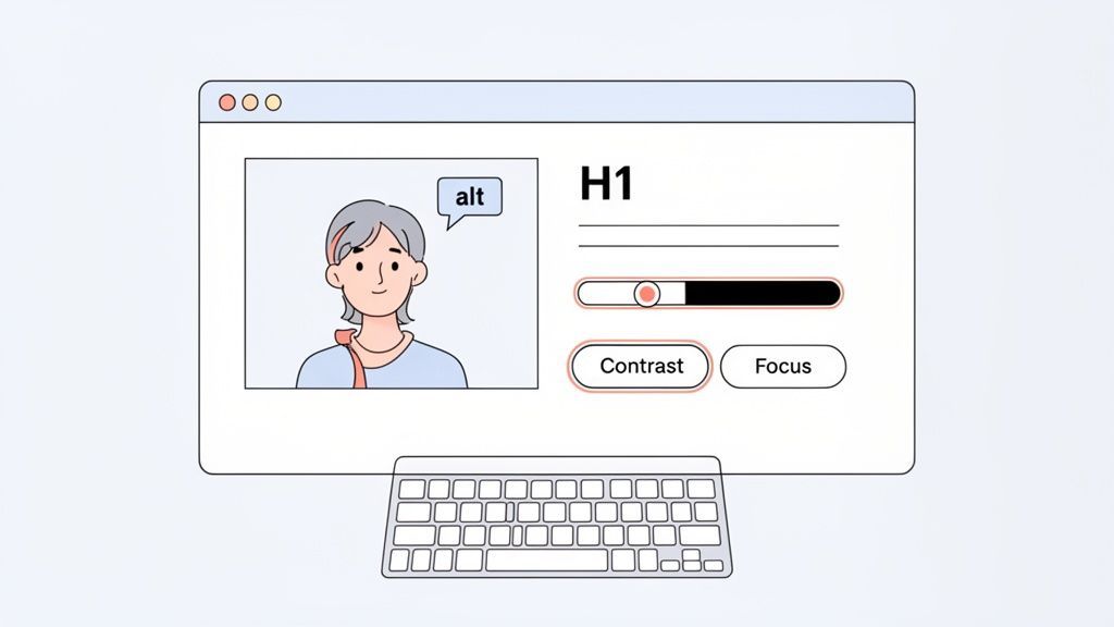
Crafting Meaningful Alt Text for Images
One of the cornerstones of an accessible web is alt text. Think of it as a short, descriptive caption tucked into an image's HTML, ready to be read aloud by a screen reader for someone who can't see the image.
Without it, a visually impaired user encounters a blank, silent spot where crucial information might be. Good alt text fills that gap, painting a picture with words and ensuring the visual context isn't lost.
Getting it right is pretty straightforward:
Be Specific, Not Poetic: Just describe what you see. "Black wireless headphones with a matte finish" is infinitely more helpful than a vague "headphones."
Explain the Why: If an image is a link or a button, its alt text needs to describe the action. A search icon's alt text should be "Search," not "magnifying glass."
Skip the Obvious: Screen readers announce that something is an image, so there’s no need to start with "An image of..." or "A picture of...". Just jump right into the description.
Building a Logical Content Structure
A clean, predictable structure isn't just nice to look for sighted users; it's a non-negotiable for anyone using assistive tech. Proper heading tags—H1, H2, H3, and so on—create a clear outline of the page.
Many screen reader users navigate by jumping from heading to heading to find what they need, much like skimming chapter titles in a book. If you use headings just to make text bold or big, you break this fundamental navigation tool.
Imagine trying to read a book with no chapter titles or page numbers. That's what a poorly structured webpage feels like to a screen reader user. A logical heading structure is the digital equivalent of a clear table of contents.
For a rock-solid structure, just follow these simple rules:
One H1 to Rule Them All: Every page gets one—and only one—
<h1>. This is your main page title.Don't Skip Levels: Headings must follow a logical order. An
<h2>can be followed by another<h2>or an<h3>, but you should never jump from an<h2>straight down to an<h4>.Style with CSS, Not Headings: If you just want to change how text looks, use your stylesheet. Heading tags are for structure, not aesthetics.
Ensuring Sufficient Color Contrast
Text that fades into its background is frustrating for anyone, but for users with low vision or color blindness, it can be completely unreadable. This is where contrast ratios come in.
The WCAG AA standard sets a clear target: a contrast ratio of at least 4.5:1 for normal text and 3:1 for larger text. This isn't just about passing a test; it’s a design fundamental that makes your content easier for everyone to read, especially on a phone screen in bright sunlight. You can learn more about how to integrate accessibility features into your design process and make this a core part of your workflow.
Designing Clear Keyboard Focus Indicators
A huge number of people navigate the web without a mouse. They rely on the Tab key to jump between links, buttons, and form fields. The focus indicator—that outline or border that appears around the active element—is their only way of knowing where they are.
Too often, designers disable the browser's default focus style because they think it looks ugly. This is a massive mistake. It's like turning off the lights and asking someone to find their way around an unfamiliar room.
The solution isn't to remove it, but to design a better one. Create a bold, clear focus indicator that matches your brand and makes it impossible to get lost on the page.
Using ARIA for Complex Components
Sometimes, plain old HTML can't quite describe what a fancy, custom-built widget does. Think of complex menus, interactive sliders, or tab panels. That’s where ARIA (Accessible Rich Internet Applications) comes into play.
ARIA attributes are like little notes you add to your code to give assistive technologies more context. You can use ARIA to announce that an accordion is "expanded" or "collapsed," or to tell a screen reader that a group of links is actually a navigation menu. It’s a powerful toolkit, but it requires care—using ARIA incorrectly can cause more confusion than not using it at all.
Streamlining Your Accessibility Strategy
Let's be realistic: keeping a website accessible is a moving target. What works today can break tomorrow after a simple content update or code push. If you treat accessibility as a one-and-done project, you're setting yourself up for failure. The real challenge isn't just getting compliant; it's staying compliant as your site grows and changes.
The secret is to stop chasing down issues after they pop up and instead build a proactive, forward-thinking system. A smart strategy has two main parts: it uses technology to automatically catch new problems around the clock, and it gives visitors tools to adjust the site for themselves on the fly. This way, you're fixing things for the long haul while providing immediate help to those who need it.
Building a Sustainable Accessibility Program
A truly sustainable accessibility program rests on two pillars: continuous monitoring and user empowerment.
Think of it like keeping a large public building safe and usable. You have an automated security system (the monitoring) that runs 24/7, alerting you to any new issues like a broken door or a burnt-out lightbulb. At the same time, you also provide immediate conveniences like ramps, adjustable lighting, and large-print signs (the user tools) so people can navigate the space on their own terms.
This dual approach means you’re always chipping away at the technical requirements behind the scenes, while your visitors get a better, more flexible experience right now. It's the most practical way to tackle the ever-shifting world of digital accessibility. To really nail this, you'll need to integrate robust automated testing best practices to keep your compliance engine running smoothly.
The Power of Continuous Automated Monitoring
Nobody has the time to manually audit an entire website every time a new blog post goes live. That's just not a scalable solution. This is where automated scanning becomes your most valuable player.
Think of these systems as a tireless watchdog, constantly patrolling your website 24/7 and sniffing out any new accessibility errors the moment they're introduced.
Here’s how automated monitoring makes compliance manageable:
Catch Problems Early: It flags potential WCAG violations—like an image uploaded without alt text or a broken heading structure—almost instantly. This stops small mistakes from snowballing into massive, site-wide problems.
Get Actionable Insights: Good scanning tools don't just point out what's broken. They give your developers detailed reports showing exactly where the problem is and often suggest the code needed to fix it, which dramatically speeds up remediation.
Prevent "Compliance Drift": Websites naturally degrade over time. Automated monitoring acts as a guardrail, ensuring your accessibility score doesn't slip and helping you consistently maintain your target standard, like WCAG 2.1 AA.
This kind of proactive scanning is the foundation of any modern accessibility plan. It transforms a monumental, manual chore into an automated, manageable process that protects your site over the long run.
Enhancing User Experience with Accessibility Widgets
While automated tools work in the background, you can also empower your visitors directly on the front end. An accessibility widget is a small toolkit on your site that lets people make instant adjustments to how the page looks and functions, all based on their personal needs.
An accessibility widget acts as a user-controlled toolkit, giving visitors the power to overcome common barriers on their own terms without needing to wait for site-wide code changes.
This puts the control right where it belongs: in the user's hands. It gives them the ability to tailor the experience to their own needs, providing immediate value and a sense of independence.
Common features you'll find in these widgets include:
Text and Sizing Adjustments: Lets users bump up the font size, increase line spacing, or even swap in a more dyslexia-friendly font.
Color and Contrast Modes: Offers presets like high-contrast, dark mode, or grayscale to make text pop for users with low vision or color blindness.
Navigation Aids: Includes tools like a virtual keyboard for people who can't use a physical one or a "reading mask" to help users with focus disorders concentrate on one section at a time.
When you pair continuous, automated monitoring with these kinds of user-facing tools, you create a truly comprehensive accessibility program. It's a strategy that simplifies the marathon of maintaining compliance and makes a more inclusive web an achievable reality for any organization.
Common Questions About Web Accessibility
As we wrap up, let's tackle some of the questions that come up time and time again when teams start digging into web accessibility. Getting clear on these points can help cut through the confusion and make the entire process feel much more manageable.
What Is the Difference Between Accessibility and Usability?
It’s easy to see why people often mix these two up, but they’re two sides of the same coin, not the same thing. Usability is all about how easy and pleasant a site is to use for the average person. Accessibility, on the other hand, is the specific practice of removing barriers so people with disabilities can use it, period.
Here’s a simple way to think about it: an accessible website is naturally more usable for everyone. But a website that seems perfectly "usable" to most might be a complete dead end for someone who depends on a screen reader or can't use a mouse. The goal is to build for both.
Is Web Accessibility Only for People Who Are Blind?
This is probably the biggest myth out there. While screen reader compatibility is a huge piece of the puzzle, accessibility helps a far wider range of people.
We're talking about creating a better experience for individuals with:
Auditory disabilities, who need captions for videos or transcripts for audio.
Motor disabilities, who might not be able to use a mouse and rely entirely on keyboard navigation.
Cognitive disabilities, who benefit tremendously from simple language and clean, predictable layouts.
It even goes beyond permanent disabilities. Think about someone with a temporary injury like a broken arm, or even someone in a situation where they can’t turn on their sound. Good accessibility helps them, too.
Web accessibility is fundamentally about human-centered design. By creating flexible and accommodating digital experiences, you build a site that works better for everyone, regardless of their abilities or circumstances.
How Often Should My Website Be Audited for Accessibility?
Think of accessibility not as a one-and-done project, but as ongoing maintenance, just like security or performance. Your website is constantly changing with new blog posts, updated features, and fresh designs. Any one of those changes can accidentally introduce a new barrier.
Because of this, it's a great idea to schedule a deep, expert-led audit at least once a year or after any major site overhaul. But you can't just wait for that annual check-up. To stay on top of things day-to-day, automated scanning tools are your best friend. They can monitor your site 24/7, flagging new problems almost as soon as they pop up so your team can jump on them right away.
Can Improving Accessibility Also Improve My SEO?
Yes, absolutely. This is one of the most compelling business cases for accessibility. The best practices for making your site accessible are often the very same things that help you rank higher on search engines. It's a true win-win.
For example, when you write descriptive alt text for an image, you're not just helping a screen reader user understand the picture; you're also telling Google exactly what that image is about. When you use a logical heading structure (H1, H2, H3), it creates a clear roadmap for both assistive technology and search engine crawlers to follow.
At the end of the day, a more accessible site is a better experience for all users. A better experience means people stick around longer and engage more, and those are powerful signals that tell search engines your site is worth showing to more people.
Ready to build a sustainable accessibility program and unlock a more inclusive digital experience? WebAbility.io provides the automated monitoring, user-facing tools, and expert guidance you need to achieve and maintain compliance with confidence. Discover how our platform can transform your approach.
Quick Questions
Tap to ask AI about this article