Accessible design examples: 10 insights for inclusive UX

Sidharth Nayyar
TL;DR: This article provides 10 practical, real-world accessible design examples to make your website inclusive. Key takeaways include using "skip navigation" links, semantic HTML, high-contrast color schemes, and ensuring full keyboard navigation. We cover accessible forms, alt text for images, captions for videos, and properly structured data tables. Implementing these examples improves user experience for everyone, especially those with disabilities, and helps achieve WCAG compliance.
In the fast-paced world of web development and design, building websites that are usable by everyone is not just a compliance requirement, it is a business imperative. Moving from abstract principles to concrete implementation, however, can be challenging. This article cuts through the complexity by providing a curated collection of practical, accessible design examples that you can implement today. We will dissect real-world applications, offering a clear roadmap to enhance usability and ensure your digital properties are open to all users, including those with disabilities.
Before diving into specific accessible design patterns, having a clear understanding of the foundational principles is key. A solid grasp of What Is Web Accessibility provides the necessary context for implementing these examples effectively and building a truly inclusive web. This guide moves beyond mere definitions to give you the strategic and tactical tools you need.
Each section breaks down a critical accessibility pattern, from semantic HTML and ARIA labels to accessible forms and high-contrast modes. You will find:
Strategic Analysis: Why each pattern is crucial for user experience and WCAG compliance.
Actionable Takeaways: Specific, replicable code snippets and implementation notes.
Practical Tips: Guidance for applying these solutions at scale across your projects.
WebAbility.io Integration: Insights into how our tools can automate and augment these accessibility efforts.
This resource is designed for developers, designers, and digital teams seeking to build better, more inclusive digital experiences. By the end, you will have a clear, actionable playbook for improving your site's accessibility and creating a web that works for everyone.
1. Skip Navigation Links
A "skip to main content" link is a foundational accessibility feature that allows users of assistive technologies, like screen readers and keyboard-only navigation, to bypass repetitive header navigation and jump directly to the primary content of a page. This simple yet powerful tool drastically improves efficiency and reduces frustration for users who cannot rely on a mouse.
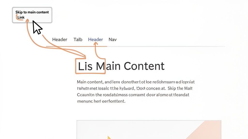
This accessible design example is crucial because it addresses a major pain point: forcing users to tab through dozens of navigation links on every single page load before they can access the content they came for. By providing a direct path, you respect their time and effort.
Strategic Breakdown & Implementation
Implementing a skip link involves placing an anchor link as the very first focusable element within the <body> of your HTML. This link targets an id attribute on your main content container (e.g., <main id="main-content">). The link itself is often visually hidden until it receives keyboard focus, at which point it becomes visible.
WCAG Success Criterion: This directly supports WCAG 2.4.1 Bypass Blocks, a Level A requirement.
User Impact: Keyboard and screen reader users can navigate sites much faster, especially content-heavy platforms like government portals (USA.gov) or educational websites (MIT.edu) that often feature extensive navigation menus.
Implementation Tip: Use CSS to hide the link off-screen and then bring it into view on
:focus. Avoid usingdisplay: none;orvisibility: hidden;, as these properties remove the element from the accessibility tree, making it unusable.
Key Takeaway: A skip link is a non-negotiable for any website with a substantial navigation header. It is one of the quickest and most impactful accessibility improvements you can make.
For a deeper dive into the technical implementation and best practices, you can learn more about skip navigation links and how to integrate them effectively.
WebAbility.io's automated scanning can quickly identify pages missing this critical feature, using its WCAG 2.4.1 audit capabilities to flag violations and ensure your site provides an efficient navigation path for all users.
2. Semantic HTML and ARIA Labels
Semantic HTML and ARIA (Accessible Rich Internet Applications) work together to build a meaningful, understandable structure for your website. Using proper HTML elements like <nav>, <main>, and <article> provides a clear blueprint, while ARIA roles and labels add crucial context for assistive technologies, ensuring they can properly interpret page layout and interactive components.
This accessible design example is fundamental because it creates a robust foundation for accessibility. When a screen reader can distinguish a header from a footer or an icon button's purpose, it can present that information logically to the user, transforming a confusing page into a navigable experience.
Strategic Breakdown & Implementation
Proper implementation starts with using native HTML elements for their intended purpose. For complex or dynamic components where HTML's semantics fall short, ARIA attributes (role, aria-label, aria-live) bridge the gap. For instance, Google Workspace uses a strong semantic structure to define its complex application layouts.
WCAG Success Criterion: This supports multiple criteria, including 1.3.1 Info and Relationships (Level A) and 4.1.2 Name, Role, Value (Level A).
User Impact: Screen reader users can efficiently understand the page layout, identify the purpose of interactive controls like icon-only buttons, and receive notifications from dynamic content updates (e.g., "Item added to cart").
Implementation Tip: Always prioritize native HTML elements over ARIA. For example, use a
<button>element instead of addingrole="button"to a<div>. Usearia-labelto provide an accessible name for controls that lack visible text, like a search icon button.
Key Takeaway: Semantic HTML is the skeleton of an accessible web page, and ARIA provides the nervous system for complex components. Using them correctly is not optional; it’s essential for functional accessibility.
For a comprehensive guide on when and how to apply ARIA roles, you can learn more about the ARIA Authoring Practices Guide (APG).
WebAbility.io's engine excels at auditing your site’s structure, using its WCAG 1.3.1 and 4.1.2 scanning capabilities to detect improper use of ARIA and non-semantic HTML, helping you build a solid foundation for accessibility.
3. High Contrast Mode and Color Contrast Compliance
Sufficient color contrast between text and its background is a cornerstone of visual accessibility, ensuring that content is readable for users with low vision or certain types of color blindness. This principle goes beyond just picking "good" colors; it involves adhering to specific ratios that allow text to be clearly distinguished from its surrounding elements. Modern accessible design examples often include adjustable high-contrast modes, empowering users to customize their visual experience.
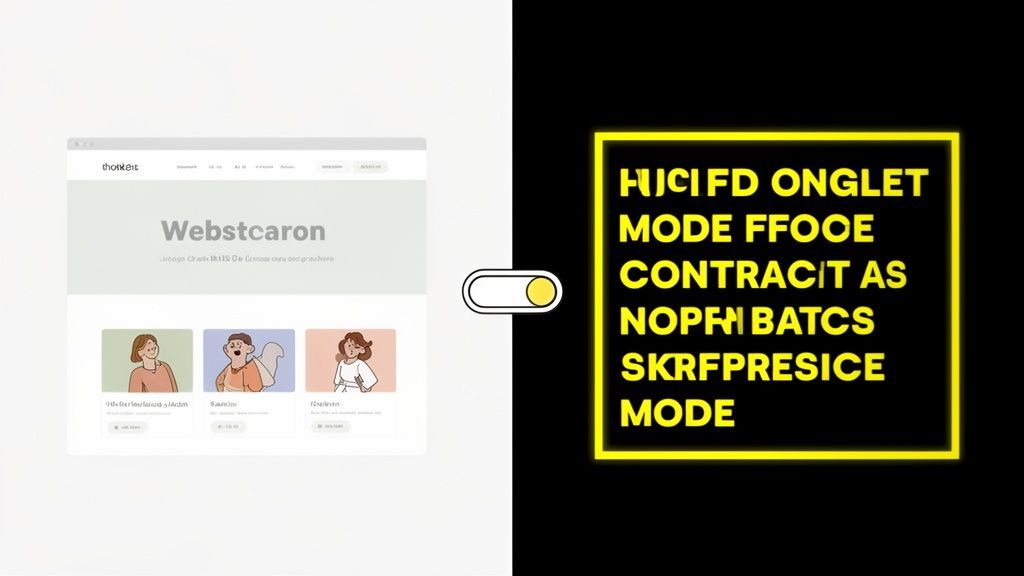
This feature is critical because it directly impacts readability. For millions of users, low-contrast text is simply illegible, creating an immediate and insurmountable barrier to accessing information. By ensuring strong contrast and offering user-controlled themes, you make your digital content usable for a much wider audience.
Strategic Breakdown & Implementation
Implementing strong color contrast involves both a default design that meets standards and, ideally, an optional high-contrast theme. The default design must meet minimum WCAG ratios, while a theme toggle (e.g., light/dark mode) can provide enhanced legibility for those who need it. It is also crucial to consider how designs appear for users with color blindness, a topic explored in detail when designing with color blind friendly colours.
WCAG Success Criterion: This supports WCAG 1.4.3 Contrast (Minimum), a Level AA requirement demanding a 4.5:1 ratio for normal text and 3:1 for large text.
User Impact: Users with low vision, such as those with cataracts or glaucoma, can read content without strain. It also benefits users in varied lighting conditions, like viewing a screen in bright sunlight. Many government sites (CDC.gov) and banking platforms (Chase.com) build their entire UI around these standards.
Implementation Tip: Use a CSS toggle to switch between stylesheets for light, dark, or high-contrast modes. Ensure that all interactive elements, including links, buttons, and form field focus states, maintain sufficient contrast in every theme.
Key Takeaway: Color contrast is not a subjective design choice; it is a fundamental requirement for readability. Build your color palette around accessibility standards from the start to avoid costly remediation later.
For a deeper analysis of specific color combinations, you can learn more aboutcolors to avoid for color blindness to ensure your design is inclusive.
WebAbility.io's automated color contrast analyzer can instantly scan your entire site, identifying any text or UI elements that fail to meet WCAG 1.4.3 and 1.4.6 (Enhanced Contrast) standards, making compliance straightforward.
4. Keyboard Navigation and Focus Management
Robust keyboard navigation and focus management are essential for digital accessibility. This practice ensures that users who cannot use a mouse, including those with motor disabilities and screen reader users, can navigate, understand, and interact with all website functionality using only keyboard commands. This involves a logical tab order, clearly visible focus indicators, and predictable behavior.
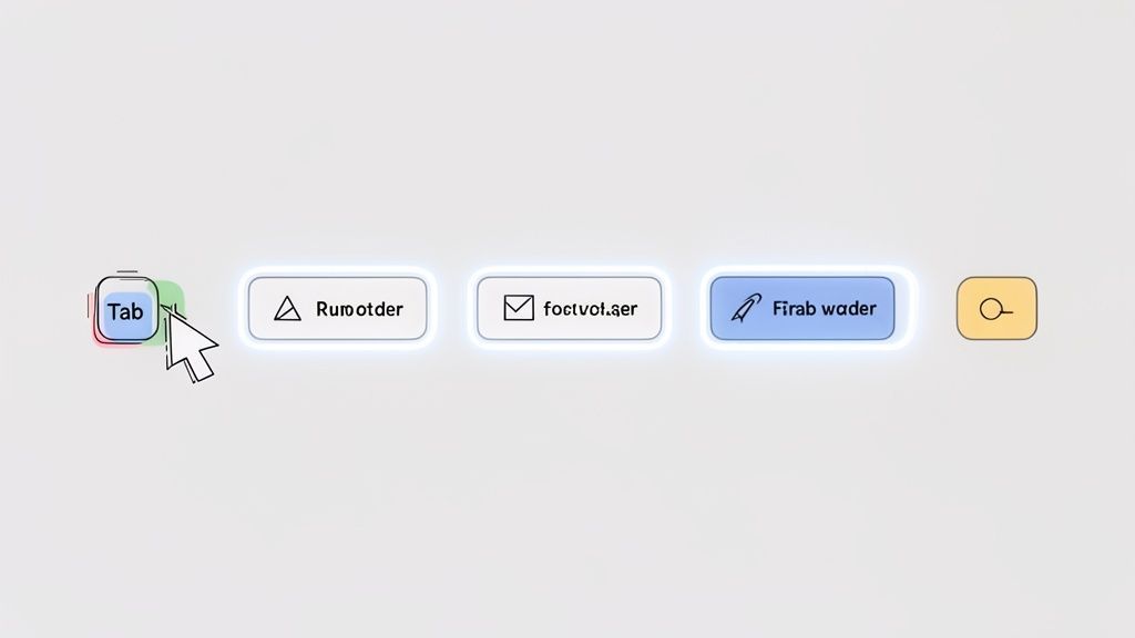
This accessible design example is fundamental because it provides an alternative pathway for interaction. Without it, entire sections of a site become unusable for a significant portion of users, creating frustrating dead ends and effectively locking them out of key content and features. Platforms like GitHub and Google Docs excel here, offering comprehensive keyboard controls that enable power users to operate efficiently without a mouse.
Strategic Breakdown & Implementation
Proper implementation means every interactive element (links, buttons, form fields) is reachable and operable via the keyboard. The focus order must follow a logical sequence that aligns with the visual layout, and the currently focused element must have a highly visible indicator. For complex components like modals or pop-ups, focus must be "trapped" inside until the user explicitly closes it.
WCAG Success Criterion: This supports multiple criteria, primarily WCAG 2.1.1 Keyboard (Level A) and WCAG 2.4.7 Focus Visible (Level AA).
User Impact: Users with motor impairments, keyboard-only users, and screen reader users can navigate independently. Clear focus styles also benefit sighted users by providing crucial visual feedback on their location within the page.
Implementation Tip: Thoroughly test your site using only the keyboard. Navigate with Tab (forward), Shift+Tab (backward), Enter/Space (activate), and Arrow keys (for widgets like menus). Ensure your CSS
:focusstyles provide a contrast ratio of at least 3:1 against the background.
Key Takeaway: If a user cannot "tab" to it and interact with it, it doesn't exist for them. Keyboard accessibility is not an add-on; it is a core requirement for a functional and inclusive user interface.
WebAbility.io's automated and manual testing features can systematically check for keyboard accessibility issues, using its WCAG 2.1.1 and 2.4.7 audit tools to pinpoint keyboard traps, missing focus indicators, and illogical tab orders that block user navigation.
5. Responsive and Scalable Text
Responsive and scalable text is a crucial accessibility practice ensuring that users can increase the size of text on a page up to 200% without breaking the layout or losing functionality. This empowers users with low vision or cognitive disabilities to adjust the content to their specific reading needs, making digital information truly accessible and readable for everyone.
This accessible design example is fundamental because it directly supports user autonomy. Instead of being locked into a fixed text size, users can control their own experience, which is particularly vital on content-heavy sites like BBC News or Wikipedia, where readability is the primary goal.
Strategic Breakdown & Implementation
Proper implementation relies on using relative units for font sizes, such as rem or em, instead of fixed px values. This allows text to scale proportionally based on the user's browser settings or page zoom level. The surrounding layout must also be built with responsive techniques (like fluid grids and flexible containers) to adapt gracefully as the text size increases.
WCAG Success Criterion: This directly supports WCAG 1.4.4 Resize text (Level AA), which requires that text can be resized up to 200 percent without loss of content or functionality.
User Impact: Users with moderate visual impairments can read content comfortably without needing screen magnification software. This improves usability for a wide range of users, including older adults and those experiencing eye strain.
Implementation Tip: Always use relative units (
rem,em,%) forfont-size,line-height, and spacing properties. Test layouts vigorously by zooming your browser to 200% and 400% to ensure no content is obscured or requires horizontal scrolling to read.
Key Takeaway: Designing for scalable text from the start is a core principle of inclusive web design. It ensures your content remains usable and readable for the widest possible audience, regardless of their visual acuity.
For a deeper dive into fluid typography and responsive techniques, you can learn more about responsive and scalable text and its impact on user experience.
WebAbility.io's automated scanner can detect text scaling issues by simulating zoom conditions, using its WCAG 1.4.4 audit capabilities to flag layouts that break or hide content when text is resized.
6. Alternative Text (Alt Text) for Images
Alternative text, commonly known as "alt text," is a fundamental accessibility feature that provides a textual description of an image. This text is read aloud by screen readers, allowing users with visual impairments to understand the content and purpose of non-text content, making it one of the most essential accessible design examples.
This accessible design pattern is critical because it ensures that information conveyed visually is equally available to all users. Without alt text, images become invisible barriers, excluding users from understanding product details on an e-commerce site like Target, grasping key data in a chart on a news site, or appreciating a photo on a platform like National Geographic.
Strategic Breakdown & Implementation
Effective alt text is concise, descriptive, and contextual. It should describe the image's content and its function within the page. For decorative images that add no informational value, an empty alt attribute (alt="") should be used to signal screen readers to ignore them, preventing unnecessary auditory clutter.
WCAG Success Criterion: This directly supports WCAG 1.1.1 Non-text Content, a Level A requirement and a cornerstone of web accessibility.
User Impact: Users with visual impairments gain equitable access to information. It also benefits users with slow internet connections or those who have disabled images, as the alt text will display in place of the unloaded image.
Implementation Tip: For complex images like charts or graphs, provide a concise summary in the alt text and link to a long description or a data table below the image. For functional images like a search icon button, describe the action (e.g.,
alt="Search"), not the image itself (e.g.,alt="magnifying glass").
Key Takeaway: Alt text is not optional; it is a core component of inclusive design. Writing meaningful alt text requires understanding the context and purpose of an image, not just its visual characteristics.
For an efficient way to generate accurate and contextual descriptions, you can use an AI alt text generator to streamline your workflow and ensure compliance at scale.
WebAbility.io's platform automates the detection of missing or inadequate alt text through its WCAG 1.1.1 audit tools, and its AI capabilities can suggest context-aware descriptions, helping you quickly remediate this common but critical accessibility issue across your entire site.
7. Accessible Forms with Clear Labels and Error Handling
Accessible forms are the backbone of digital interaction, enabling everything from user registration to e-commerce checkouts. This accessible design example focuses on creating forms with clear, programmatically associated labels and intuitive error handling, ensuring users of assistive technologies can understand and complete them without barriers. Without this, forms become unusable obstacles, blocking access to essential services.
This pattern is crucial because it ensures that every user, regardless of ability, knows what information is required for each field, understands which fields are mandatory, and receives clear, actionable feedback if they make a mistake. It transforms a potentially frustrating experience into a seamless one.
Strategic Breakdown & Implementation
Proper implementation starts with HTML semantics. Every form control (<input>, <textarea>, <select>) must have a corresponding <label> element programmatically linked via the for and id attributes. Error messages should be clearly visible and associated with the relevant field using aria-describedby to inform screen reader users.
WCAG Success Criterion: This supports multiple criteria, including 3.3.2 Labels or Instructions (Level A), 3.3.1 Error Identification (Level A), and 4.1.2 Name, Role, Value (Level A).
User Impact: Users with cognitive disabilities benefit from clear instructions, visually impaired users can navigate efficiently using labels, and keyboard users can easily interact with form fields. The forms on Gov.uk are a prime example of this pattern executed flawlessly.
Implementation Tip: Never rely solely on placeholder text as a label. It disappears on input and is often ignored by assistive technologies. Always use a visible, persistent
<label>element for maximum clarity and accessibility.
Key Takeaway: Accessible forms are non-negotiable for user engagement and conversion. Prioritizing clear labels, instructions, and error handling from the start prevents user abandonment and ensures equitable access.
For a deeper dive, you can learn more about creating accessible forms and explore various validation techniques that support all users.
WebAbility.io's automated form accessibility testing can instantly flag common issues like missing labels, insufficient color contrast on error messages, and incorrect ARIA implementation, ensuring your forms meet critical compliance standards.
8. Captions and Transcripts for Video and Audio
Captions and transcripts provide essential text-based alternatives for multimedia content, making videos and podcasts accessible to everyone. Captions display synchronized text for dialogue and important non-speech sounds, while transcripts offer a full text record of all spoken content. These features are critical for users who are deaf or hard-of-hearing but also benefit many others.
This accessible design example ensures that information conveyed through audio is not lost. Platforms like YouTube and Netflix have demonstrated how integral captions are to the user experience, allowing people to watch content in noisy environments, learn new languages, or simply comprehend complex dialogue more easily.
Strategic Breakdown & Implementation
Effective implementation involves more than just converting speech to text. High-quality captions include speaker identification and descriptions of meaningful sounds (e.g., [door slams], [upbeat music]). Transcripts should be provided as a separate, easily accessible document alongside the media player. This allows users to read at their own pace or search for specific information.
WCAG Success Criterion: This directly supports WCAG 1.2.2 Captions (Prerecorded) (Level A), 1.2.1 Audio-only and Video-only (Prerecorded) (Level A), and 1.2.3 Audio Description or Media Alternative (Prerecorded) (Level A).
User Impact: Users who are deaf, hard-of-hearing, or have auditory processing disorders can fully engage with multimedia. It also benefits non-native speakers and users in sound-sensitive environments. Leaders in this space, like TED.com, provide interactive transcripts for all talks.
Implementation Tip: While auto-captioning tools are a good start, always review and edit them for accuracy in spelling, grammar, and timing. For professional content, use a reputable service like Rev or 3Play Media to ensure high-quality, compliant captions.
Key Takeaway: Providing accurate captions and complete transcripts is a fundamental requirement for accessible multimedia. It unlocks your video and audio content for a much wider audience and improves comprehension for all users.
To learn more about creating effective text alternatives for media, you can explore the W3C’s guide on video and audio accessibility.
WebAbility.io's multimedia analysis tools can scan your embedded videos and audio files, using its WCAG 1.2.2 audit capabilities to detect missing captions or transcripts, helping you ensure all your content is universally accessible.
9. Accessible Data Tables with Proper Headers and Structure
Presenting data in tables can be a major accessibility hurdle if not coded correctly. Accessible data tables use proper HTML markup to create clear relationships between headers and their corresponding data cells. This structure allows screen reader users to navigate the table intelligently, understanding the context of each piece of data without getting lost.
This accessible design example is fundamental for any site presenting tabular information, from financial reports to product comparisons. Without proper structure, a screen reader announces data as a confusing jumble of disconnected cells, rendering the information unusable and creating a significant barrier for users.
Strategic Breakdown & Implementation
Proper implementation involves using semantic HTML elements like <caption>, <thead>, <tbody>, <th>, and the scope attribute. The <th> tag defines a cell as a header, while the scope attribute (col for column headers, row for row headers) explicitly tells assistive technology which cells that header applies to.
WCAG Success Criterion: This directly supports WCAG 1.3.1 Info and Relationships, a Level A requirement.
User Impact: Screen reader users can navigate complex data sets efficiently. For example, on a U.S. Census Bureau data table, a user can hear the column and row headers announced as they move through cells, instantly understanding that "1,250,000" corresponds to "Population" and "California."
Implementation Tip: Always use
<th>elements for headers, never styled<td>elements. For every<th>, include ascope="col"orscope="row"attribute to create a robust, programmatically determinable relationship between headers and data.
Key Takeaway: Semantic HTML is not optional for data tables. Using
<th>withscopeis the most reliable way to ensure that the relationships within your data are clearly communicated to all users.
For a deeper dive into creating both simple and complex accessible tables, you can learn more about table concepts and advanced techniques like using id and headers attributes.
WebAbility.io's platform can automatically audit your site's data tables, using its WCAG 1.3.1 inspection tools to identify missing headers, incorrect scope attributes, and other structural issues that impede accessibility.
10. WebAbility.io Accessibility Widget as Comprehensive Solution
While individual component-level fixes are crucial, a comprehensive accessibility solution like the WebAbility.io widget offers a scalable, integrated approach to compliance. This modern platform combines over 40 accessibility features into a single, user-friendly interface that site visitors can customize to meet their specific needs, from adjusting fonts and contrasts to enabling screen readers and navigation aids.
This type of accessible design example provides a powerful layer of user-controlled adjustments on top of a site's existing code. It empowers users to create their own accessible experience in real-time while providing organizations with a framework for continuous monitoring and compliance with standards like ADA, WCAG 2.1 AA, and Section 508.
Strategic Breakdown & Implementation
Implementing an accessibility widget involves adding a short code snippet to your website, which then deploys a customizable interface. This toolset works alongside your existing accessibility efforts, offering users immediate control over their browsing environment. It’s particularly effective for large-scale operations, such as e-commerce platforms or enterprise companies managing multiple digital properties.
WCAG Success Criterion: This solution helps address multiple criteria across all four principles (Perceivable, Operable, Understandable, Robust) by providing user-configurable tools for contrast (1.4.3), text resizing (1.4.4), and keyboard navigation (2.1.1).
User Impact: Users with diverse needs gain the autonomy to adjust the site's presentation instantly, overcoming barriers that may not have been addressed in the base code. This is a significant benefit for users with visual, cognitive, or motor impairments.
Implementation Tip: Start by using a free scanner to get a baseline audit of your site's current compliance level. Implement the widget on critical user journeys first, like checkout flows or login pages, to maximize immediate impact.
Key Takeaway: An integrated accessibility widget provides a fast, scalable, and user-empowering layer to your overall accessibility strategy, helping achieve and maintain compliance while improving the user experience for everyone.
For organizations looking to implement a comprehensive solution, you can learn more about the WebAbility.io accessibility platform and its full suite of features.
WebAbility.io's dashboard offers continuous compliance tracking and detailed reporting, allowing teams to monitor accessibility metrics, document progress for legal purposes, and integrate remediation efforts directly into their development workflows.
10 Accessible Design Features Comparison
| Pattern | Implementation complexity | Resource requirements | Expected outcomes | Ideal use cases | Key advantages |
|---|---|---|---|---|---|
| Skip Navigation Links | Low | Minimal HTML/CSS, basic testing | Faster keyboard traversal; WCAG 2.1 A compliance | Content-heavy sites, government and education portals | Quick to implement; improves keyboard & screen-reader navigation |
| Semantic HTML and ARIA Labels | Medium | Developer ARIA knowledge, screen reader testing | Clear structure for assistive tech; SEO benefits | Dynamic apps, custom widgets, enterprise UIs | Robust semantic structure; improves accessibility and discoverability |
| High Contrast Mode and Color Contrast Compliance | Medium | Design revisions, contrast testing tools, user prefs | Improved legibility; WCAG AA contrast compliance | Sites with visual content, low-vision audiences, branding-sensitive sites | Enhances readability for many users; user-adjustable display modes |
| Keyboard Navigation and Focus Management | Medium–High | Significant dev effort, keyboard/screen-reader testing | Full keyboard operability; meets focus-related WCAG criteria | Complex web apps, modal/dialog-heavy interfaces, productivity tools | Enables mouse-free use; critical for motor-impaired and power users |
| Responsive and Scalable Text | Low–Medium | CSS changes (em/rem), responsive testing at zoom levels | Text scales to meet WCAG (200%); improved readability | News sites, reading-focused platforms, e‑commerce | Improves readability across devices; relatively easy to verify |
| Alternative Text for Images | Low–Medium | Content authoring, possible AI-assisted generation + review | Images accessible to screen readers; SEO gains | Image-heavy sites, e‑commerce, media publishers | Essential for blind users; improves search and fallback behavior |
| Accessible Forms with Clear Labels and Error Handling | Medium | Proper markup, validation logic, ARIA for dynamic errors, testing | Higher completion rates; clearer error recovery; WCAG compliance | Checkout flows, registrations, government forms, surveys | Reduces user errors; supports cognitive and assistive needs |
| Captions and Transcripts for Video and Audio | High | Captioning/transcription services or tooling; human review | Media accessible to deaf/hard-of-hearing users; transcript indexing | Streaming platforms, e‑learning, corporate/marketing videos | Enables multimedia access; improves searchability and compliance |
| Accessible Data Tables with Proper Headers and Structure | Medium–High | Semantic table markup, screen reader testing, possible redesign for responsiveness | Accurate table navigation and data relationships for assistive tech | Financial reports, healthcare records, government/statistics tables | Preserves data context; improves comprehension for screen readers |
| WebAbility.io Accessibility Widget as Comprehensive Solution | Low–Medium | Integration, configuration, subscription, occasional manual remediations | Broad accessibility features, continuous monitoring, compliance reporting | Organizations needing fast, scalable multi-site accessibility | All-in-one toolset with automated scanning and centralized management |
From Examples to Action: Your Path to an Accessible Future
We've journeyed through a comprehensive collection of accessible design examples, moving from foundational elements like skip navigation links and semantic HTML to more complex challenges like accessible forms and data tables. Each example serves as more than just a technical blueprint; it represents a commitment to creating digital experiences that are open, inclusive, and effective for every user, regardless of their abilities.
The core lesson from these examples is that accessibility is not a feature you add at the end. It is a fundamental principle woven into the entire design and development lifecycle. Implementing proper alt text isn't just about SEO or compliance; it's about providing context to those who cannot see an image. Ensuring keyboard navigation works flawlessly isn't a niche requirement; it's essential for users with motor disabilities and a quality-of-life improvement for power users.
Key Insights from Our Exploration
Reflecting on the patterns we've analyzed, several key themes emerge as critical for any team looking to build an accessible web:
Structure is Everything: Semantic HTML (like
<nav>,<main>,<button>) provides the essential scaffolding that assistive technologies rely on. When native HTML isn't sufficient, ARIA roles and properties bridge the gap, but a strong semantic foundation is always the best starting point.Clarity Overrides Complexity: From clear form labels and explicit error messages to descriptive link text and proper table headers, every example underscores the importance of clear communication. An interface that is easy to understand is inherently more accessible.
Flexibility is Non-Negotiable: Users must be able to customize their experience. This means ensuring text can be resized without breaking the layout, providing high-contrast modes, and supporting various input methods beyond a mouse. True accessibility empowers user choice.
Turning Knowledge into Scalable Practice
Understanding these accessible design examples is the first step. The true challenge lies in applying them consistently and at scale across entire organizations, complex websites, and evolving applications. This is where a strategic approach, combining manual best practices with powerful automation, becomes indispensable.
For development teams and digital agencies, the goal is to create a sustainable "accessibility-first" culture. This involves:
Integrating Accessibility into Your Workflow: Start accessibility checks during the design phase, not just before launch. Use checklists based on WCAG principles and the examples in this article.
Automating Where Possible: Leverage automated tools to catch common issues like color contrast violations or missing alt text early and often. This frees up manual testing resources to focus on more nuanced user experience issues.
Educating and Empowering Your Team: Share these examples with designers, developers, and content creators. The more your team understands the "why" behind accessibility, the more naturally they will build inclusive products.
Building an accessible digital presence is a continuous journey, not a one-time project. By starting with the concrete, replicable strategies we've discussed, you are not just mitigating legal risks or adhering to standards. You are actively expanding your audience, improving the user experience for everyone, and building a brand that stands for inclusivity and respect. The path forward begins with a single step, a single component, a single line of code. Let these examples be your guide.
Ready to move beyond individual fixes and implement a comprehensive, scalable accessibility strategy? WebAbility.io provides the automated scanning, continuous monitoring, and user-facing tools you need to manage compliance efficiently. Explore how our platform can help you apply these accessible design principles across your entire digital portfolio at WebAbility.io.
Quick Questions
Tap to ask AI about this article