Making the Web Readable Your Guide to Color Contrast Accessibility

Sidharth Nayyar
TLDR: Good color contrast is essential for making your website's text and visuals easy to see for everyone, including people with visual impairments and those viewing your site in bright light. This is measured using a "contrast ratio," and the goal is to meet the Web Content Accessibility Guidelines (WCAG) standards—typically a ratio of 4.5:1 for normal text. Low contrast is the most common accessibility issue on the web, but it's also one of the easiest to fix with free tools that can check your color pairings. Prioritizing color contrast not only improves user experience but also broadens your audience and aligns with legal accessibility requirements.
In a nutshell: Color contrast is all about making sure your text and essential visuals are easy to see against their background. It's a simple concept with a huge impact, affecting everyone from users with visual impairments to someone trying to read your site on their phone in bright sunlight.
The goal is to meet the Web Content Accessibility Guidelines (WCAG) for contrast ratios. Getting this wrong is the single most common accessibility mistake on the web, but the good news is that it’s also one of the simplest to fix when you have the right tools and mindset.
Your Quick Guide to Better Color Contrast
Why Good Color Contrast Is a Web Essential
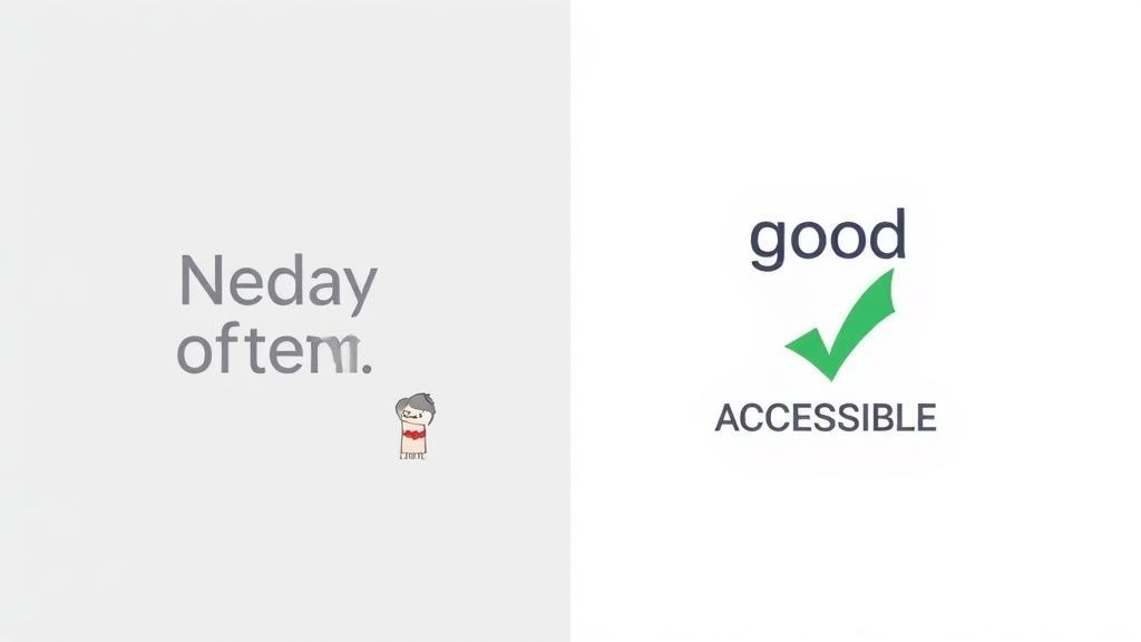
Let's stop thinking about color contrast accessibility as just another box to check on a technical list. Instead, imagine trying to read a faint pencil sketch on a gray wall. That struggle is exactly what low-contrast websites feel like for millions of people every single day. Good contrast isn't a bonus feature; it's a fundamental pillar of usable and effective web design.
This is really about basic communication. When you get the contrast right, you’re making sure that the content you worked so hard to create is actually clear and readable for the largest possible audience. It’s the difference between a user getting frustrated and leaving, and a user having a smooth, successful visit.
More Than Just a Niche Concern
While strong contrast is absolutely critical for users with visual impairments, its benefits ripple out to everyone. Ever tried using your phone in bright sunlight? The glare washes out the screen, making low-contrast text nearly impossible to see. That’s a temporary, but very real, barrier to getting information.
This same problem affects people using older monitors, someone working in a poorly lit room, or even just a person with tired eyes after a long day at the computer. Good contrast is a universal design principle. It makes text easier to read for all your visitors and reduces the mental effort needed to understand your content.
The Human Impact of Color Choices
Being thoughtful about your color choices is non-negotiable if you want to build a truly usable website. There are approximately 300 million people worldwide with some form of color blindness, which can make it incredibly difficult to tell certain shades apart. For this huge group, strong contrast isn't a nice-to-have—it's the only way they can properly navigate and understand what's on the screen. You can explore more on the importance of color in digital accessibility to see just how deep this issue goes.
Good color contrast isn't an "extra" feature; it's a core component of communication. If users can't read your message, your design has failed, no matter how beautiful it looks.
Ultimately, putting color contrast first shows you’re committed to every single user who visits your site. It sends a clear message that you value clarity and inclusivity over trendy aesthetics that might only work for a fraction of your audience. When you make these conscious choices, you create a digital space that truly welcomes everyone, builds trust, and makes sure your message is heard loud and clear.
How to Measure and Understand Contrast Ratios
Those technical ratios, like 4.5:1, can feel a bit abstract at first. Here’s a simple way to think about it: imagine adjusting the contrast on your TV. You're just measuring the difference in brightness—or luminance—between your text and its background. The higher the first number in the ratio, the bigger the difference, and the easier it is to read.
This isn’t some arbitrary rule. It's a practical way to answer one simple question: "Can people actually see this?" Once you get that, the whole world of color contrast accessibility starts to click. You’re not just following rules anymore; you're seeing why they matter for creating a better experience for everyone.
You can see how all these pieces—accessibility, readability, and the overall user experience—fit together as essential parts of a great website.
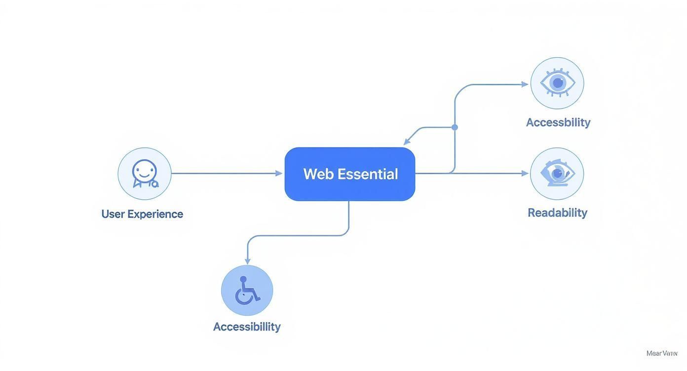
Good contrast isn't just a technical checkbox. It’s right at the heart of building a high-quality, user-focused website.
Decoding WCAG Conformance Levels
So, what numbers should you aim for? The Web Content Accessibility Guidelines (WCAG) give us clear targets. For most projects, you’ll be focused on two main levels of conformance.
Level AA (Minimum Contrast): This is the standard you’ll see most often. It’s the baseline for good accessibility and requires a contrast ratio of at least 4.5:1 for normal text. For large text (think 18.66px bold or 24px regular), the requirement is a bit more relaxed at 3:1.
Level AAA (Enhanced Contrast): This is the next level up. It provides an even better reading experience by demanding a contrast ratio of at least 7:1 for normal text and 4.5:1 for large text. It’s a fantastic goal for sites where readability is absolutely critical.
While hitting Level AAA is the gold standard, reaching Level AA is a huge win. It makes your website accessible to a much wider audience and shows a real commitment to inclusive design.
If you want to get into the nitty-gritty of how these numbers work, our glossary entry on contrast ratio breaks it all down.
What About Non-Text Elements?
Contrast isn't just for words on a page. Think about all the other visual cues you rely on—icons, form field borders, and buttons. These all need to be clearly visible too.
For these kinds of user interface components, WCAG sets the minimum contrast ratio at 3:1 against any adjacent colors. This simple rule ensures people can spot interactive elements and understand how your site works, preventing a lot of unnecessary frustration.
Why Low Contrast Is the Web's Most Common Barrier
You'd think the biggest accessibility problems on the web would be complex coding issues, right? It's actually something much more fundamental: color. Low color contrast isn't just a minor annoyance; it's the single most common accessibility failure out there, tripping up users on millions of websites every single day.
This isn't some niche problem, either. A recent WebAIM Million report found that a jaw-dropping 79.1% of homepages had text that failed basic contrast standards. To make matters worse, each of those pages had, on average, nearly 30 separate instances of this error. If you'd like to discover more insights about these accessibility findings, the data paints a very clear picture of the challenge.
These numbers show a huge gap between what looks good to designers and what’s actually readable for a huge portion of the population. It's a real, tangible issue that we all have a responsibility to fix.
Common Pitfalls That Lead to Poor Contrast
So, if it’s so easy to fix, why is this problem everywhere? It usually boils down to a few common design habits that prioritize style over substance.
Aesthetics Over Readability: We’ve all seen it—the super minimalist design with light gray text on a white background. It might look clean and sophisticated to some, but for many people, it’s practically unreadable.
Brand Colors Used Blindly: A company's brand colors might look fantastic on a business card or a billboard, but that doesn't mean they'll work on a screen. Teams often slap brand colors onto a website without ever checking if they pass accessibility contrast ratios for text.
Unchecked Text on Images: This is a classic one. Placing text directly over a busy photograph without a proper overlay, background, or shadow is a recipe for disaster. As the colors of the image shift, parts of your text can completely vanish.
Low contrast is an invisible barrier. To a designer, it might look like a clean, modern choice. To a user with low vision, it can look like an empty page.
The Opportunity for Immediate Impact
While the prevalence of low contrast is a serious problem, here's the good news: it's also one of the easiest accessibility issues to fix. This is your low-hanging fruit for making a massive, immediate improvement.
Unlike wrestling with complex ARIA roles or JavaScript interactions, fixing contrast can be as simple as tweaking a single hex code in your CSS. By just being a little more thoughtful about your color palette, you can resolve dozens of issues with minimal effort.
Tackling color contrast is one of the fastest ways to show a genuine commitment to your users and start building a more inclusive web for everyone.
Your Toolkit for Testing Color Contrast
https://www.youtube.com/embed/D8TPUqbhRmA
Knowing the rules of color contrast is one thing, but putting them into action is what really makes a difference. The good news? You don't have to be a coding genius to start testing your designs. There's a whole world of powerful, easy-to-use tools out there to help you spot and fix problems in no time.
Making that jump from theory to practice has never been more straightforward. Whether you're a designer, a developer, or a content manager, there's a tool that will slide right into your existing workflow.
Finding the Right Tool for the Job
The accessibility community has built an incredible lineup of resources, and many of them are completely free. You can find everything from browser extensions that scan entire pages to simple online checkers for quick, instant feedback.
Here are a few of the most popular options that pros use every day:
Browser Extensions: Tools like Axe DevTools plug right into your browser, letting you scan live web pages and pinpoint contrast errors on the fly.
Online Checkers: The WebAIM Contrast Checker is the industry standard for quickly testing a specific text and background color pair.
Design Software Plugins: Modern design tools like Figma have fantastic plugins that check for color contrast right inside your design files. This lets you catch issues long before a single line of code is written.
A Quick Walkthrough Using WebAIM
Let's run through a quick example with the WebAIM tool. All you need are two hex codes: one for your text color and one for the background it sits on.
The checker immediately does the math, calculating the contrast ratio and telling you if it passes WCAG AA and AAA standards for both normal and large text. It's that simple.
This screenshot shows the WebAIM tool failing a light gray text on a white background. The 2.78:1 ratio is clearly marked as a "Fail" because it doesn't meet WCAG AA or AAA standards for any text size.
With this kind of instant feedback, you can tweak the colors right there on the spot until you get a passing result. This simple back-and-forth process is the heart of effective contrast testing, a key to inclusive digital design. Making these checks a regular part of your routine is how you build a website that everyone can read and use.
Of course, you can fix color contrast issues as they pop up, but why not stop them from happening in the first place? A much better approach is to design an accessible color palette right from the very beginning. This isn't just about picking colors you think look nice; it's about building a system where every text and background combination is guaranteed to be readable for everyone.
Taking this step early on creates consistency and takes the guesswork out of the equation for your designers and developers. When everyone on the team has a pre-approved, accessible palette to pull from, good contrast becomes a natural part of your design language—not an afterthought you have to scramble to fix later.
Start with Strong Base Colors
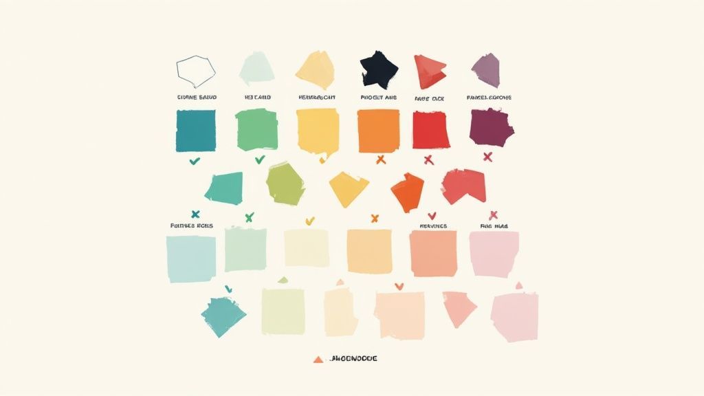
First things first: choose your primary and secondary brand colors. Go for hues that are vibrant and clearly distinct from one another. If you lean on subtle, low-contrast shades for your core palette, you’re setting yourself up for accessibility headaches right out of the gate.
Once you have those base colors selected, run them through a contrast checker. See how they pair up, especially with standard black and white text. This quick test immediately tells you which colors will make great backgrounds and which ones are better suited for text or smaller accent elements.
A truly effective color palette is a functional tool, not just a decorative one. It should guide users, highlight important information, and ensure readability is never compromised.
Generate Accessible Tints and Shades
Here's a common mistake I see all the time: designers create lighter or darker versions of a color without ever checking the new contrast ratios. Just lowering a color's opacity to create a "tint," for instance, almost always leads to poor contrast against white text.
Instead, you need to be more methodical. Generate a range of tints (by adding white) and shades (by adding black) for each of your base colors. As you create each new variation, test it against your text colors to see which combinations pass WCAG AA or AAA standards. This process helps you build a really solid library of pre-approved color pairs. For a deeper dive, check out how to create a colorblind-friendly palette to support an even wider range of users.
Document and Share Your System
The final piece of the puzzle is to document your accessible palette in a clear, easy-to-use style guide. This guide should be super explicit about which color combinations are approved for what purpose. No ambiguity.
Text on Backgrounds: Make a definitive list of all approved text and background color pairings.
UI Components: Define the accessible color combinations for buttons, links, and their various states (like hover or active).
Non-Text Elements: Specify combinations for things like icons, form field borders, and focus indicators that meet the 3:1 contrast ratio.
Creating an accessible color palette from the start is a cornerstone of modern website design best practices. By building and sharing a documented system, you empower your entire organization to create beautiful and inclusive digital products. It turns color contrast from a recurring problem into a solved one.
Why Great Contrast Is Simply Smart Business
It's easy to get bogged down in the technical details and think of color contrast as just another item on a compliance checklist. But that’s missing the forest for the trees. Getting your color contrast right isn't a chore—it's a fundamental business decision that affects your reach, your reputation, and ultimately, your revenue.
Think about it: if people can't read what's on your site, they won't just squint and try harder. They'll leave. And they probably won't be back.
Making sure your content is easy to read is a direct investment in your user experience. It smooths out the journey for everyone, builds a subtle layer of trust, and makes your digital doorstep feel welcoming to the largest possible audience. This isn't just a "nice-to-have"; it translates directly into more people sticking around, higher conversion rates, and a brand that people feel good about.
It's About More Than Just Good Design
Beyond making your site more usable, paying attention to contrast guidelines carries real ethical and legal weight. Governments around the world have passed laws that mandate digital accessibility, and these laws often point directly to WCAG standards. Ignoring something as basic as color contrast accessibility can open your business up to some serious legal headaches and financial penalties. To see just how far-reaching this is, you can learn more about the global impact of color contrast.
Putting accessibility first isn’t just about dodging legal trouble. It's a clear statement about your company's values. It tells the world you're committed to inclusivity and that you want to serve every customer, regardless of their abilities.
Build a Stronger Brand and Reach More People
In a crowded market, a genuine commitment to accessibility can really make you stand out. It shows that your brand is thoughtful, modern, and cares about people. That kind of reputation builds incredible loyalty, especially with a growing number of consumers who actively choose to support inclusive companies.
At the end of the day, good contrast is just good business. It opens you up to a much bigger audience, reduces your legal risk, and aligns your brand with powerful values like respect and inclusivity. For those looking for the bigger picture, folding accessibility into your design is one of the most effective actionable website design tips for small businesses you can implement. By simply making your content clear and readable, you’re not just ticking a box—you’re building a more successful and respected brand.
Answering Your Top Color Contrast Questions
Let's dive into some of the real-world challenges that pop up when you start getting serious about color contrast. These are the questions our team hears all the time from designers and developers trying to get it right.
What About Text on Images?
This is probably the biggest headache. You have a beautiful hero image, but how do you make sure the text on top of it is actually readable? The background can shift from dark to light, making a single text color impossible.
The simplest, most effective fix is to use an overlay. You can place a solid color block just behind the text, or you can apply a semi-transparent dark or light layer across the entire image. This creates a stable, predictable background for your text, guaranteeing it will be legible no matter what part of the photo it’s over.
My Brand Colors Are Failing the Contrast Check. Now What?
Don't panic! This happens more often than you'd think. Your brand guide was likely created for print, where lighting and context are different. The solution isn't to abandon your brand, but to expand it for the web.
Create an "accessible" digital palette. This involves developing slightly darker or lighter variations of your primary brand colors that meet the WCAG AA standards. These become your go-to shades for text, buttons, and other crucial interface elements, ensuring you stay on-brand and inclusive.
How Do I Handle Gradients?
Gradients are another tricky area. When you place text on a gradient, which part of the background do you test it against?
The rule is simple: you must test the text against the part of the gradient that offers the worst contrast. If your white text sits over a gradient that fades from dark blue to light blue, you have to check its contrast against the lightest blue point it touches. If it fails there, it fails everywhere.
Remember, the whole point of color contrast is to make things clear and functional. Your design's aesthetic should never get in the way of someone's ability to read your message or use your product.
What's the "Good Enough" Minimum I Should Aim For?
While perfection is great, you need a practical starting point. The universally accepted baseline for accessibility is WCAG Level AA. For normal text, that means a contrast ratio of at least 4.5:1. Hitting this target ensures your site is usable for most people with visual impairments and keeps you in line with legal standards.
Ready to stop guessing and start fixing? WebAbility.io takes the manual work out of finding contrast errors. Our platform scans your site automatically, giving you a clear list of what to fix. Visit the WebAbility.io website to start a free trial and build a more inclusive experience today.
Quick Questions
Tap to ask AI about this article