Creating a Colorblind Friendly Palette That Works

Sidharth Nayyar

TL;DR: Your Quick Guide to Accessible Colors
Don't Rely Only on Color: Always use icons, patterns, or text labels to convey important information. Color should be a secondary cue.
Prioritize High Contrast: Ensure text is readable against its background. Aim for a WCAG AA ratio of at least 4.5:1 for normal text.
Avoid Problematic Pairs: Steer clear of red/green, green/brown, and blue/purple combinations, as they are often indistinguishable for users with color vision deficiency.
Use Tools to Test: Use browser extensions like Colorblinding or built-in Figma/Adobe features to simulate how your design looks to people with different types of color blindness.
Start with Safe Colors: Blue and orange are a great starting point for a palette as they are easily distinguished by most people.
So, what exactly is a colorblind-friendly palette? It’s a thoughtfully selected group of colors that people with different types of color vision deficiency can actually tell apart. The whole idea is to use high contrast and sidestep color combinations that are known to cause problems, making sure your website is clear and usable for everyone. It’s a huge piece of the inclusive design puzzle.
Your Quick Start to Accessible Color Palettes

Think of this as the TL;DR for busy designers and developers. If you need the core principles now, this is your starting point. The goal here is to give you an immediate, practical foundation for choosing colors before we dive into the nitty-gritty details later on.
Before you get too deep into swatches and hex codes, it's really helpful to get a solid understanding web accessibility as a whole. Accessible color is just one, albeit critical, part of that bigger picture.
Core Principles for Inclusive Colors
Building a design that works for everyone doesn't mean you have to create something bland or boring. It’s all about making smart, informed choices that improve the experience for the estimated 300 million people worldwide who live with some form of color blindness.
If there's one takeaway, it's this: never rely on color alone to get your message across.
"In data visualization, color sets the tone and enforces a message... It creates a certain atmosphere and can turn an unassuming visualization into an emotion-filled data story."
That's powerful, but it means a great palette needs backup from other visual cues. Here’s what I always focus on first:
Prioritize High Contrast: The difference in brightness between your text and its background is non-negotiable. It's probably the most critical factor for readability across the board.
Use Non-Color Cues: Don't just make the "error" field red; add an icon or a bold text label. In charts and graphs, this is huge—use patterns, distinct shapes, or direct labels to help users tell things apart.
Avoid Problematic Pairs: From experience, certain color combos are just a no-go. The most common offenders are red/green, green/brown, and blue/purple. They often look identical to people with color vision deficiencies, so it's best to just steer clear.
Why Inclusive Color Palettes Matter
Building a colorblind friendly palette isn't just a box-ticking exercise; it's about making sure your message actually lands with everyone, barrier-free. When we overlook color accessibility, we're basically signing off on creating frustrating, confusing experiences for a huge chunk of our audience.

Globally, we're talking about 4% of the population—that's over 200 million people—who have some form of color vision deficiency. This isn't a niche problem. Surveys show that a staggering 90% of color-blind individuals say it negatively impacts their work, and 30% of children feel it holds them back in school.
This goes way beyond a minor inconvenience. It’s a core usability issue that can stop people from understanding data, finishing a purchase, or seeing a critical warning.
The Real-World Impact of Poor Color Choices
Think about a typical sales dashboard where green means "good" and red means "bad." For someone with Deuteranopia (the most common type of red-green color blindness), those two colors might look almost identical. Just like that, the entire chart becomes useless.
This common pitfall highlights a golden rule of accessible design: color should not be the only way you communicate information.
You see these problems pop up all over the web:
Status Indicators: A user could easily miss a critical error message if the only change is the text color switching from green to red.
Data Visualizations: On complex graphs or maps, colors without enough contrast can just melt into an unreadable blob for users with certain types of color blindness.
Navigation Links: If the only difference between a link you've clicked and one you haven't is a subtle shift from blue to purple, it makes it incredibly difficult for some people to track where they've been.
A poorly chosen palette doesn't just look bad; it actively excludes users. Designing for color blindness is a fundamental aspect of creating an effective user interface that serves everyone equally.
Getting a handle on these challenges is the first step. To really go deeper, you can explore our detailed guide on https://www.webability.io/blog/what-do-colorblind-people-see-web-accessibility-tips-for-inclusive-design to build your expertise.
Beyond Usability: The Business and Legal Case
Making your website accessible isn't just the right thing to do—it's also just plain smart for business. An accessible site opens your doors to a wider audience, which can boost engagement and expand your potential market. On the flip side, a frustrating user experience is a fast track to high bounce rates and lost customers.
Then there's the legal side of things. Accessibility standards are increasingly becoming legal requirements. Getting familiar with ADA compliant website requirements is a crucial step to understand your responsibilities.
Building accessibility in from the ground up helps sidestep legal trouble and shows your brand is committed to inclusivity. A thoughtful, accessible color palette is one of the most important first steps in that process, making your design both ethical and effective.
Building Your Palette with Accessibility in Mind
Creating a palette that works for everyone isn't about following a rigid set of rules, like simply avoiding red and green. It's more of a strategic way of thinking—a framework that uses contrast, brightness, and smart design cues to build an inclusive experience from the very beginning.
This isn't a niche concern. Color vision deficiency affects roughly 8% of males and 0.5% of females with European heritage, and those numbers shift across different populations worldwide. When you stop and think about it, that’s a significant chunk of your audience, especially when color is your main tool for communicating information in things like data visualizations.
Think in Terms of Contrast, Not Just Color
Instead of getting hung up on which specific hues to avoid, let's shift the focus to how your chosen colors interact with each other. A truly robust palette is built on strong variations in brightness (value) and intensity (saturation). With enough contrast, even colors that are traditionally tricky, like blue and purple, can sit side-by-side perfectly if one is significantly lighter or more vibrant than the other.
A good way to visualize this is to imagine your design in black and white. You can still distinguish every element, right? That’s because of the clear differences in light and shadow. We need to apply that same exact principle to our color choices.
The big secret is that most people with color vision deficiency see contrast just fine. When you make one color very dark and another very light, you’re creating a distinction that doesn't rely on hue at all.
We actually have a whole guide that dives deep into the technical side of this. You can check out our post on creating accessible color contrast for a step-by-step on how to measure and nail this.
Use More Than Just Color to Tell the Story
Here’s the golden rule I always come back to: never rely on color alone to convey critical information. Your color palette needs backup singers. By adding other visual indicators, you create layers of clarity that make the experience better for everyone, not just those with color blindness.
And the great thing is, these additions are usually simple to implement but incredibly effective.
Bring in Patterns and Textures: When you're designing charts or graphs, use things like stripes, dots, or different line styles to distinguish between data sets. This makes a bar chart or a complex map instantly readable, even if two colors look identical to someone.
Lean on Icons and Symbols: Don’t just make a success message green; pair it with a checkmark icon. An error message shouldn't just be red; add a warning triangle. These symbols are universally understood and reinforce the message instantly.
Label Things Directly: Instead of forcing users to match a colored line on a graph to a separate legend, just label the line directly. It's a small change that removes a huge point of friction.
A Simple Framework for Choosing Your Colors
When you're ready to start building the palette itself, don't just pick colors at random. Start with a clear plan.
Anchor with "Safe" Hues: I often start with blues and oranges. They tend to be a very safe bet, as they remain distinct across most common forms of color blindness. They make for a great foundation.
Add Your Neutrals: A solid range of neutrals—black, white, and a few shades of gray—is non-negotiable. They do the heavy lifting, creating contrast and giving your primary colors a clean stage to shine on.
Create Tints and Shades: For each primary color you've selected, create a few lighter and darker variations. This simple step gives you a whole family of related colors to work with for backgrounds, text, and UI states like hover or focus.
By weaving these strategies together—strong contrast, non-color cues, and a thoughtful color selection process—you’ll end up with a colorblind friendly palette that feels both beautiful and incredibly functional. It’s about making sure your design speaks clearly to every single person who sees it.
Essential Tools for Testing Your Palette
Picking a strong color palette is a great start, but theory can only take you so far. The real test happens when you see how those colors perform in the wild. Thankfully, you don't need a fancy setup to see your design through the eyes of someone with color blindness. There's a whole host of powerful, and often free, tools to help you put your palette through its paces.
The trick is to weave these checks right into your design process. Don't wait until the final handoff. Test your colors at every stage—from the first wireframes and mockups all the way to the live site. This way, you catch problems early and build a truly accessible product from the ground up.
Online Simulators and Browser Extensions
One of the fastest ways to get a reality check is with an online simulator. These web-based tools are simple: you upload an image of your design and instantly see how it looks to people with different types of color vision deficiencies. They're perfect for a quick gut check.
For a more hands-on approach, browser extensions are your best friend. A tool like Colorblinding for Chrome can overlay a colorblindness filter on any live webpage. This means you can actually interact with your design—click buttons, read charts, fill out forms—to see if any crucial information gets lost in translation.
The point of a simulator isn't just to make sure your design still "looks nice." It's a functional test. Can a user still tell the difference between a success message and an error alert? Is that complex data visualization still readable?
Built-in Features in Your Design Software
These days, many design platforms are building accessibility checks right into their core features. Tools like Figma and the Adobe Creative Suite now include plugins or native features that let you preview your designs through various colorblindness filters without ever leaving the app. This is a massive time-saver for designers.
Working with these integrated tools lets you make adjustments on the fly. If you see two colors blending together under a Deuteranopia filter, you can tweak their brightness or saturation and see the results instantly. It makes for a much smoother and more effective workflow.
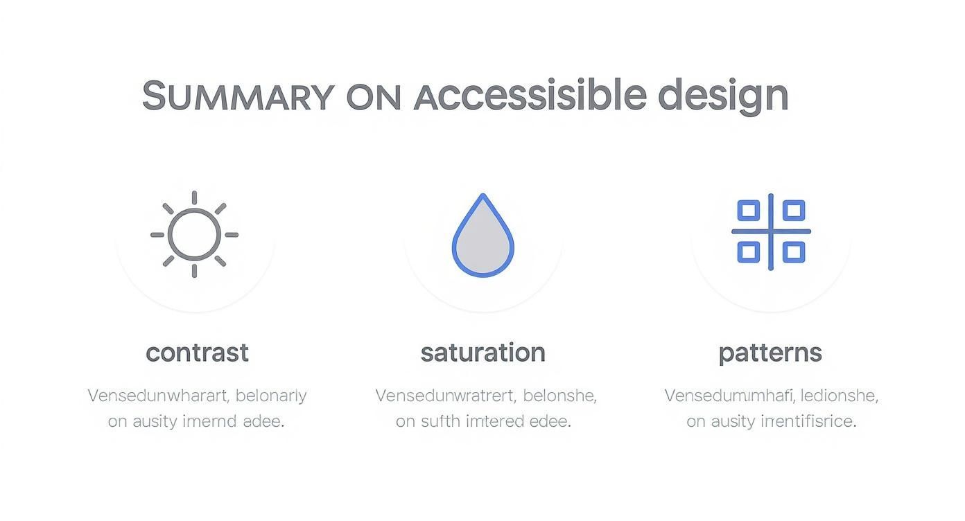
As the graphic above shows, it's the combination of different visual cues—not just color—that creates a truly robust and inclusive design.
Finding the Right Tool for the Job
To help you get started, I've put together a quick comparison of some of the most popular and reliable free tools out there. Each one has its own strengths, so you can pick the one that best fits into your current workflow.
Top Tools for Colorblind Palette Testing
| Tool Name | Type | Best For | Key Feature |
|---|---|---|---|
| Coblis Simulator | Web-based | Quick image uploads & static design checks | Simulates 8 types of color vision deficiency side-by-side. |
| Colorblinding | Chrome Extension | Live website testing & interactive elements | Applies a real-time filter to any page you're browsing. |
| Stark | Design Plugin | Integrated workflow within Figma, Sketch, & Adobe XD | Offers a suite of tools including a simulator & contrast checker. |
| WhoCanUse | Web-based | Checking text contrast against various impairments | Shows contrast ratios for different vision types, including cataracts. |
No single tool is a magic bullet. The best approach is to combine a simulator for a qualitative feel with a contrast checker for quantitative data.
Going Beyond Simulators with Contrast Checkers
While simulators are fantastic for visual checks, you also need the hard numbers to back up your choices. That’s where contrast checkers come in. Accessibility standards like the WCAG provide clear minimum contrast ratios (4.5:1 for normal text and 3:1 for large text) to ensure legibility.
Dozens of free tools let you pop in the hex codes for your foreground and background colors and get an instant pass/fail score based on these guidelines. This completely removes the guesswork.
For a comprehensive list of options, our guide on web accessibility testing tools covers contrast checkers, screen readers, and more. By combining visual simulation with data-driven contrast checks, you get a complete picture of your palette's performance, ensuring it's both functionally sound and technically compliant.
Putting Your Accessible Palette into Practice
https://www.youtube.com/embed/i_XKZcaNMUk
Alright, so you’ve done the hard work of selecting a truly colorblind-friendly palette. That’s a huge win, but the job isn’t finished. The real test is bringing those colors to life in your actual project. This is where the careful planning from the design phase needs to translate seamlessly into the final, functional user interface that people will see and interact with.
Getting this handoff right is critical. Without a clear plan, all that effort you put into choosing the perfect accessible shades can fall apart during development, leading to inconsistency and frustration.
Don't Just Share Hex Codes, Create a Style Guide
The first thing you need to do is build out a comprehensive style guide. Think of this as the single source of truth for your entire color system. It’s not just for designers; developers, content creators, and marketers should all be able to reference it. This document is what prevents ambiguity down the line.
A great style guide does more than just list colors. It gives your team the context and rules they need to use the palette correctly and consistently.
For every color in your palette, your guide should detail:
Color Swatches: Show the color itself, along with its HEX, RGB, and HSL values so there's no confusion.
Design Tokens: This is a game-changer. Give each color a semantic name like
color-primary-actionorcolor-border-subtle. This moves the conversation away from "that blue color" to "our primary action color."Intended Use: Be explicit. Spell out exactly where each color belongs. For example, "Use for all primary call-to-action buttons" or "This is for body text on light backgrounds only."
Accessibility Notes: This is crucial. Document the WCAG contrast ratio for every approved color combination. You might note that
color-primary-actionachieves a 7.5:1 ratio on a white background, making it AA and AAA compliant for normal text.
By documenting the why behind your color decisions, you're doing more than just setting rules—you're teaching your team. This builds a shared vocabulary and understanding of accessibility that pays dividends for years to come.
Bringing Your Palette into the Codebase
Now for the developers. The best way to implement a color system in a modern web project is with CSS custom properties (often called CSS variables). This approach is incredibly powerful because it centralizes all your color definitions, keeping your codebase clean and remarkably easy to maintain.
Instead of scattering hex codes all over your stylesheets (a nightmare to update), you define them one time at the root.
It looks something like this:
:root {
--color-brand-primary: #005A9C;
--color-brand-accent: #FFA500;
--color-text-default: #1A1A1A;
--color-ui-success: #007F00;
--color-ui-error: #D20000;
}
From there, applying colors is clean and consistent. Even better, if you ever need to tweak a color for a rebrand or to bump up its contrast, you only have to change it in one spot. The update will cascade everywhere that variable is used. It’s a massive time-saver.
Thinking Beyond the Obvious UI Elements
An accessible color palette is about more than just buttons and text. You need to consider how these colors function in more complex situations.
Here are a couple of common scenarios I see all the time:
Link States: How do you show
hover,focus, andvisitedlinks? Don't just rely on a color change, as that won't be enough for many users. You should always supplement the color shift with another visual cue, like adding an underline, making the text bold, or some other non-color-dependent decoration.Data Visualizations: Charts and graphs are a classic accessibility challenge. When you're designing them, you can't assume everyone can tell your colors apart. Pair your accessible palette with other cues—use different patterns, textures, or direct labels on pie slices or bars to ensure the data is crystal clear for everyone.
By creating a bridge from design to development with a solid style guide and smart coding practices, you ensure your colorblind-friendly palette doesn't just look good in a Figma file—it works beautifully in the final product.
Answering Your Questions About Accessible Color Palettes
As you begin putting these ideas into practice, you're bound to run into some specific questions. It's one thing to understand the theory, but applying it to a real-world project with existing brand constraints is another challenge entirely. Let's tackle some of the most common hurdles I see designers and developers face.
Think of this as the practical advice you need to move forward with confidence and create a palette that truly works for everyone.
What’s the Most Common Type of Color Blindness to Design For?
Statistically, your main focus should be on red-green color blindness. This bucket includes both Deuteranopia and Protanopia and affects up to 8% of men and 0.5% of women with Northern European roots. That's a significant chunk of your potential audience.
But here’s the thing: designing only for the most common type is a rookie mistake. A truly robust and inclusive palette also accounts for blue-yellow deficiencies (Tritanopia). The real secret, though, is to obsess over contrast. When you nail high contrast across the board, your design becomes more resilient and usable for people with all types of color vision.
The goal isn't just to cater to the most common color vision deficiency. It's to build a system so robust with contrast and non-color cues that it works for nearly everyone, regardless of how they perceive color.
Can I Still Use Brand Colors if They Aren't Accessible?
Yes, you absolutely can—you just need to be smart about it. Brand colors are often sacred, but that doesn't mean they have to torpedo your accessibility efforts.
Here's how you can make it work:
Use them decoratively. Relegate problematic brand colors to accents, background patterns, or large-scale decorative elements where they don't convey critical information.
Create a separate UI palette. For the essentials—body text, links, buttons, and form fields—lean on a dedicated, fully accessible palette that complements your brand.
Tweak them for compliance. Sometimes, a small adjustment is all you need. Try creating accessible variations by tweaking the brightness or saturation of a brand color just enough to pass WCAG contrast ratios. This often preserves the brand's spirit while making it functional.
What Are the Best Colors to Start With for an Accessible Palette?
If you're starting from scratch and want a foolproof foundation, you can't go wrong with a palette built around blue and orange. This combination is a classic for a reason—it remains remarkably distinguishable across most types of color vision deficiencies.
Start with those two as your primary action colors. Then, back them up with a strong set of neutrals: a solid black, a clean white, and several shades of gray. This simple combination gives you everything you need to establish high contrast for text, backgrounds, and interactive elements. From this base, you can build out a beautiful and effective colorblind friendly palette.
Ready to ensure your website is accessible for everyone? The WebAbility.io platform provides AI-enhanced tools and real-time monitoring to help you achieve and maintain full compliance with standards like WCAG and ADA. Start your journey toward a more inclusive web by learning more about WebAbility.io.
Quick Questions
Tap to ask AI about this article