Mastering Web Page Headings for SEO and Accessibility

Sidharth Nayyar
TL;DR: Your Quick Guide to Effective Web Page Headings
- Structure is King: Use headings (H1, H2, H3, etc.) to create a logical outline for your content. Think of it as a table of contents for your page.
- One H1 Per Page: Your H1 is the main title and should state the page's primary topic clearly. Use it once.
- Follow the Order: Never skip heading levels (e.g., don't jump from an H2 to an H4). This is crucial for screen reader users and SEO.
- Headings Drive Conversions: Write clear, user-focused headings to guide visitors to important information and actions, like exploring your WebAbility.io services.
- Accessibility is Non-Negotiable: A proper heading structure is one of the most impactful ways to make your site accessible for people using assistive technologies.
- Audit and Fix: Regularly use tools to audit your headings for errors like skipped levels or multiple H1s to maintain a healthy, high-performing website.
Let's get straight to the point: web page headings (H1 through H6) are the structural backbone of your content. My experience in digital strategy has shown that mastering them is a direct path to demonstrating authority and trustworthiness. Think of them as the chapter titles and subheadings of your webpage, creating an outline that guides both human visitors and search engine crawlers.
A logical heading structure is a powerful signal of quality to Google, directly influencing your E-E-A-T (Experience, Expertise, Authoritativeness, and Trustworthiness). It's also a fundamental pillar of web accessibility and a surprisingly effective tool for boosting your SEO.
Your Quick Guide to Effective Web Page Headings
Imagine picking up a book with no chapter titles or table of contents. It would be a nightmare to navigate. The same is true for your website. Your visitors—and the search engine bots that index your pages—rely on headings to make sense of the information you present.
The H1 is the single most important heading; it’s the title of the entire page, declaring its main topic. From there, H2s, H3s, and so on, break down the content into main sections and subsections, creating a clear hierarchy that makes even complex topics easy to follow.
This isn't just about looking organized. It's a core principle I've seen deliver results time and again. When search engines can easily understand the structure of your content, they can more accurately match it to what people are searching for. That means better visibility for you.
Why Structure Matters for Business Growth
Good heading structure goes far beyond just ticking a box for search engines. It has a real, measurable impact on how users behave on your site and, ultimately, your conversion rates (CRO).
Let's be honest: people don't read websites; they scan them. Your headings are the signposts that help them quickly find what they need. When a visitor can instantly spot the answer to their question, they’re far less likely to hit the "back" button and far more likely to stick around.
This positive experience builds trust and helps you guide visitors toward your most important actions. A well-placed heading can be the bridge between a casual reader and a potential customer.
For instance, a heading like "Explore Our Service Packages" within a relevant blog post creates a natural, intuitive path for users to discover your offerings. It turns a simple piece of content into an active part of your sales funnel.
Suddenly, your content isn't just sitting there—it's working for you. Getting your headings right delivers a few key wins:
- Improved User Experience: Scannable, navigable content keeps people on your page longer.
- Enhanced SEO Performance: A clear hierarchy helps search engines understand and rank your content for the right keywords.
- Better Accessibility: Screen reader users depend on headings to navigate. A logical structure is a necessity for an inclusive experience.
- Higher Conversion Rates: By guiding users to valuable information, you can point them toward key pages, like our WebAbility.io product tour.
To give you a clearer picture, here's a simple breakdown of what each heading level is designed for.
Heading Levels and Their Purpose at a Glance
This table sums up the primary job of each heading, where you'll typically see it used, and why it's important for the overall structure of the page.
| Heading Level | Primary Role | Common Use Case | Structural Importance |
|---|---|---|---|
| H1 | The main title of the page | Blog post title, product name, "About Us" | Highest |
| H2 | A main section of the page | Major topics within a blog post, key feature sections | High |
| H3 | A subsection within an H2 block | Sub-points, specific examples, or details of a main topic | Medium |
| H4 | A sub-subsection within an H3 block | Supporting details or tertiary points | Moderate |
| H5 | A further level of detail within an H4 block | Granular points, often used for definitions or annotations | Low |
| H6 | The lowest level of subheading | Fine-print details, footnotes, or other nuanced content | Lowest |
While you might not always use H4 through H6, understanding their place in the hierarchy is key to building a properly structured page, no matter how simple or complex the content is.
In the end, mastering your heading structure is about creating a better, more inclusive experience for everyone. It's a foundational practice that pays off in user satisfaction, accessibility compliance, and tangible business growth.
Why Headings Are the Backbone of Your Web Page
Your web page headings are far more than just big, bold text. Think of them as the architectural framework of your content. Without a proper heading structure, you’re left with a wall of text that’s confusing for your readers and completely unreadable for the technology they depend on.
Headings give your content a logical, semantic hierarchy. The H1 is the title of the whole page—its single main idea. H2s are like the main chapters of a book, breaking down the topic into major sections. H3s, in turn, act as sub-chapters, diving into the specific details of each section.
Structuring Content for Clarity and Technology
Based on extensive experience with both SEO and accessibility, I can confirm this structure is a critical signal for technology. For search engines, a clean heading hierarchy makes it incredibly easy to understand your content's topics and subtopics. This helps them accurately rank your page for very specific user searches, because they can see how all the information is related.
This structure is even more important for people using assistive technologies. For screen reader users, headings are the number one way to navigate a page. They can pull up a menu of all headings to get a quick outline of the content and jump straight to the section that interests them. It’s the digital equivalent of a sighted person scanning a page for headlines.
A proper heading structure isn't just a best practice; it directly addresses core accessibility requirements like WCAG success criterion 1.3.1 Info and Relationships. It's a simple change that makes your content work better for everyone.
This diagram illustrates how that top-down structure should look, flowing from the main page title down through its various sections and sub-sections.
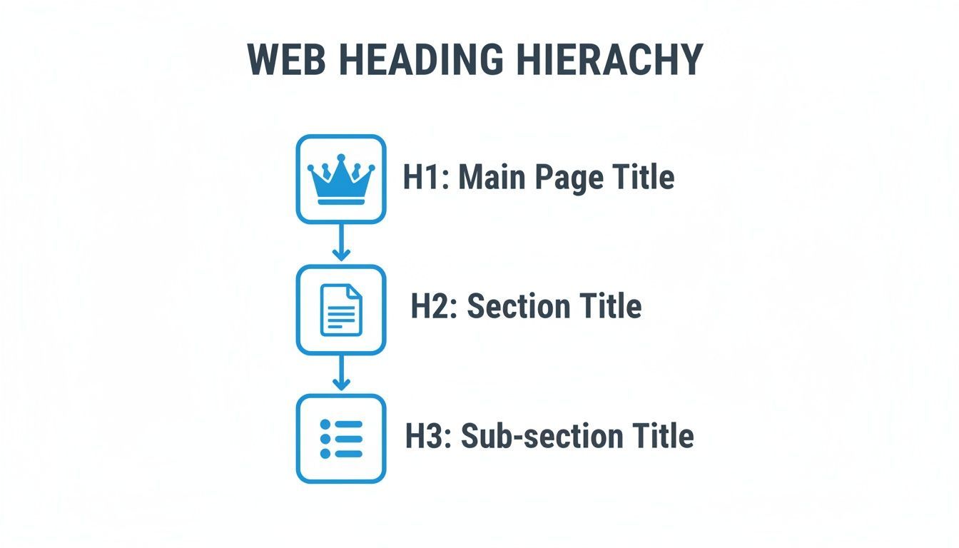
As you can see, each heading level has a distinct role, creating a clear and predictable path through your information.
The Importance of Sequential Order
The real power of this structure lies in keeping the heading levels in the correct order. You can’t just skip levels because it looks better visually. Jumping from an H2 straight to an H4, for instance, breaks the logical outline.
Imagine reading a book that skips from Chapter 2 to a random sub-point in Chapter 4—you'd be completely lost. That’s exactly what it feels like for a screen reader user when heading levels are skipped.
Always follow a logical sequence:
- Correct: H1 → H2 → H3 → H2 → H3 → H4
- Incorrect: H1 → H3 → H2 → H5
You can always go back up the chain (like finishing a section with an H3 and starting a new major section with an H2), but you should never skip levels on the way down. Getting this right is one of the easiest and most effective ways to improve both accessibility and SEO. To dig deeper into this rule, explore our guide on the importance of headings hierarchy.
From Structure to Strategy
A solid heading structure isn't just about tidy organization; it’s a strategic tool. When users can scan your page and find what they need in seconds, they have a much better experience. This means they stick around longer and are less likely to "bounce," sending positive signals to search engines that your content is valuable.
Clear, descriptive headings also create perfect opportunities for smart internal linking. A well-written H2 can smoothly guide a reader from an informational article to a core service page, effectively turning a curious visitor into a potential customer. This is how you build a site that doesn’t just share information—it drives results.
How Headings Boost Your SEO and User Experience
Getting your heading structure right isn't just about ticking a technical box. It’s one of the most effective ways to connect your content directly to real-world business results, influencing everything from your SEO performance to your user experience (UX) and conversion rates.
Think of web page headings as a tool with two jobs: they need to speak clearly to search engines and, at the same time, guide your human visitors.
For search engines like Google, your headings are a roadmap to your page's content. The crawler looks first to your H1 tag to grasp the main topic. It then scans the H2 through H6 tags to map out all the supporting ideas and sub-topics. This clear structure gives Google the confidence to match your page to a wider variety of search queries, especially those valuable long-tail keywords.
From Rankings to Revenue
Properly structured headings are also your ticket to earning valuable screen real estate on search engine results pages (SERPs). Google frequently pulls text from well-defined H2 or H3 sections to create featured snippets and fill out "People Also Ask" boxes. These rich results stand out, capture attention, and drive high-intent traffic directly to your site.
From a user's point of view, headings are all about scannability. Let's be honest—most people don't read web pages word-for-word. They scan, looking for quick answers to their specific questions. Your headings act as signposts, helping them find what they need in seconds and drastically improving their experience on your page.
This improved user journey has a direct impact on key engagement metrics. When visitors can easily find what they’re looking for, they stay longer, explore more pages, and are far less likely to "bounce" back to the search results. These are powerful positive signals that tell search engines your content is valuable and authoritative.
That’s where a great user experience starts feeding your business goals. A smooth, frustration-free visit builds trust and clears the path for a visitor to become a customer.
Writing Headings That Convert
The best headings do more than just organize a page; they persuade and guide the reader. By writing compelling, benefit-focused headings, you can pull people deeper into your content and gently nudge them toward the actions you want them to take.
Here’s how to craft headings that work for both search engines and your conversion goals:
- Be Clear, Not Clever: Your heading must immediately tell the reader what the section is about. Vague or artsy headings just create confusion and can cause people to leave.
- Include Keywords Naturally: Weave your target keywords into your headings where they feel natural, especially in your H1 and main H2s. This reinforces your page's topic for search engines.
- Focus on User Intent: Frame your headings around the questions your audience is asking. A heading like "How to Choose the Right Plan" is much more effective than a generic one like "Our Plans."
This approach turns your headings into a powerful tool for guiding behavior. A descriptive heading can, for example, create a perfect transition into a call-to-action, pointing visitors toward a pricing page, contact form, or product demo.
If you want to dive deeper into the core principles behind this, our guide on what semantic HTML is and why it matters is the perfect place to start. By connecting the dots between structure, SEO, and user psychology, you can make your headings work much harder for your business.
Making Your Headings Accessible to Everyone
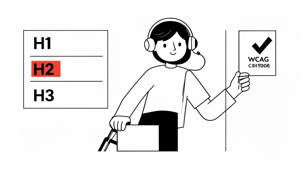
While good web page headings make content easier to scan for all of us, they are an absolute lifeline for people who use assistive technologies. Getting your heading structure right isn't just a "nice-to-have" design detail—it's a core requirement for building an inclusive website that welcomes every visitor.
This isn't just my opinion; it’s a key principle of the Web Content Accessibility Guidelines (WCAG). Specifically, Success Criterion 1.3.1 Info and Relationships requires that a page's structure can be understood by technology. In other words, your headings must form a logical outline that software can interpret.
For someone using a screen reader, that outline is everything.
The Screen Reader Experience with Headings
Think about picking up a book and finding there's no table of contents or chapter titles. Where would you even start? That’s what it feels like for a screen reader user to land on a page with a messy heading structure.
Screen reader software does more than just read text aloud. One of its most powerful features is the ability to pull up a list of all headings on the page. This creates an instant, navigable outline, allowing the user to understand the page's main topics and jump straight to the section that matters to them. It's a game-changer for efficient browsing.
A clean, sequential heading structure (H1 → H2 → H3) is arguably the single most important factor for making long articles accessible. It lets a screen reader user scan the page just as quickly as a sighted person.
But when that structure is broken, the whole experience unravels, creating frustrating dead ends and confusion.
Common Mistakes and Their Impact
Even tiny errors in your heading hierarchy can cause huge problems. The most common mistake I see is skipping heading levels—like jumping from an <h2> right to an <h4>. To a sighted user, it might look fine, but for assistive tech, it completely breaks the logical flow.
And this isn't a niche problem. A recent web analysis uncovered 1,088,074 skipped heading levels on major homepages, impacting a staggering 39% of all pages reviewed.
Here are the critical mistakes you need to watch out for:
- Skipping Levels: When you jump from an
<h2>to an<h4>, the user is left wondering what happened to the<h3>. It's like a chunk of the outline went missing, making them question if they’ve missed important information. - Using Multiple
<h1>s: While HTML5 technically allows this, it’s poor practice. A page should have one main topic, defined by a single<h1>. Having more than one is like a book with two competing titles—it just creates confusion. - Creating "Fake" Headings: Simply making text bold and increasing the font size does not create a heading. Screen readers and search engines see it as just another paragraph, so it offers no structural value for navigation.
These mistakes don't just create a poor user experience; they can put you at odds with compliance guidelines. If you want to dive deeper into the core principles, it's worth understanding the official Web Accessibility WCAG standards.
The best path forward is almost always the simplest: stick to native HTML elements (<h1>, <h2>, etc.). For most content, there's no substitute for clean, semantic HTML. By getting your headings right, you’re not just checking a box—you’re making your content better for everyone and opening your digital door to a much wider audience.
How to Audit and Fix Common Heading Issues
Knowing the rules for proper headings is a great start, but the real work begins when you have to find and fix the mistakes on a live website. To make sure your site is actually accessible and performing well in search, you need a solid process for auditing your web page headings.
Think of it as a two-pronged attack. First, you get your hands dirty with some manual checks to understand the real-world user experience. Then, you bring in the big guns—automated tools—to scan your entire site quickly and efficiently.
Starting with a Manual Audit
Before you run any software, I always recommend starting with a manual check. It’s the best way to step into your users' shoes and see your content structure through their eyes. The good news is, you don't need anything fancy to get started—just your web browser.
The simplest trick is to use your browser's built-in Developer Tools. Just right-click anywhere on your page, select "Inspect," and you can see the raw HTML. This lets you immediately spot obvious problems, like text that looks like a heading but isn't wrapped in an <h1> or <h2> tag, or headings that skip a level.
Another powerful technique is to fire up a screen reader. Most screen readers have a shortcut that pulls up a neat list of all the headings on the page. This gives you a bird's-eye view of your content's outline. Is it logical? Does it make sense?
Expert Tip: A well-structured heading outline should read like a clear table of contents. If you get lost just reading the list of headings, you can bet your users are, too.
If you want to go even deeper on reviewing your content's structure and overall effectiveness, this practical SEO content audit guide is a fantastic resource.
Scaling Up with Automated Tools
Manual checks are great for getting a feel for a page, but they just don't scale. If your website has more than a few pages, trying to check every single one by hand is a recipe for frustration. That’s where automated tools become essential. Platforms like WebAbility.io are built to handle this heavy lifting for you.
An automated scanner can crawl your entire site in minutes, flagging all sorts of heading issues that are nearly impossible to find manually.
- Skipped Heading Levels: Instantly catches where you've jumped from an
<h2>to an<h4>, breaking the hierarchy. - Multiple
<h1>Tags: Finds pages with more than one main title, which can confuse both search engines and screen readers. - Empty Headings: Flags
<h3></h3>tags with no text inside, which create annoying "phantom" stops for screen reader users. - Improper Order: Detects illogical sequences that don't follow a top-down structure.
The best part is that a good tool presents all this data in a central dashboard, giving you a complete overview of your site's health and helping you prioritize the most urgent fixes.
This screenshot from a WebAbility.io report shows just how clearly errors are flagged, categorized, and made ready for your team to tackle. 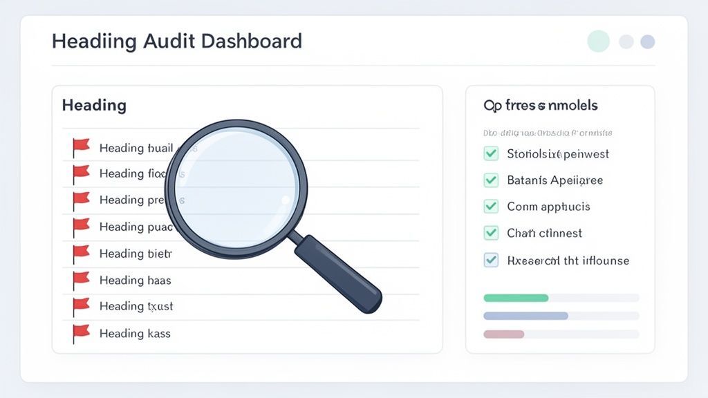 With a dashboard like this, you can easily see the scope of the problem and track your progress as you knock out each issue.
A Practical Remediation Checklist
Once you've found the errors, the fix is usually pretty simple. Whether you're in a CMS like WordPress or digging into the code, the steps are basically the same.
- Identify the Error: Use your audit report to find the exact issue and which page it's on.
- Locate the Element: Go into your CMS editor or HTML file and find that specific heading.
- Apply the Fix: Adjust the heading tag to the correct level. For example, if you have an
<h4>directly under an<h2>, you'll likely need to change it to an<h3>. - Verify the Change: Rerun the scan or do a quick manual check to make sure the fix worked.
Making this a regular part of your website maintenance is a proactive way to keep your site accessible and SEO-friendly. If you’re looking to build a more formal and comprehensive testing strategy, you can learn more about how to conduct a full website accessibility audit.
Frequently Asked Questions About Web Page Headings
Even after you get the hang of headings, some tricky questions always seem to pop up. Let's tackle some of the most common ones I hear from designers, developers, and content creators. Here are some straightforward answers to help you handle headings with confidence.
Can I Have More Than One H1 Tag on a Page?
This one’s a classic debate. While HTML5 technically says you can have multiple <h1> tags, the long-standing best practice for both SEO and accessibility is simple: stick to just one.
Think of your <h1> as the title of a book. One book, one main title. It gives the page a single, clear focus. Using more than one can muddy the waters for search engines trying to figure out what your page is really about. More importantly, it can be downright confusing for someone using a screen reader who expects a single, overarching topic for the page.
For the best results, a single
<h1>per page is still the safest and most effective strategy. It sets a clear hierarchy from the top and makes sure everyone—and every bot—gets the point.
Should I Put Keywords in My Headings?
Yes, absolutely. Putting relevant keywords in your headings is a smart move for SEO. Your <h1> and <h2> tags are especially powerful signals that tell search engines what your content is about and which searches it should show up for.
But there's a catch. You have to write for people first. Your headings need to be clear, make sense, and read naturally.
Don't fall into the trap of "keyword stuffing," where you awkwardly cram keywords into headings. It creates a terrible experience for your readers and can get you penalized by search engines.
- Good: "How to Choose the Right Web Page Headings"
- Bad: "Web Page Headings Best SEO Headings for Web Pages"
The goal is to write a compelling, user-friendly heading that just so happens to include your main keyword.
What Happens If I Skip a Heading Level?
Skipping heading levels—like jumping from an <h2> straight to an <h4>—is a bigger deal than you might think. For someone just looking at the page, the visual styling might hide the mistake. It looks like a subhead, so who cares, right?
Well, screen reader users care. A lot. They often navigate by pulling up a list of headings, which should read like a perfectly nested table of contents. When a level is missing, it breaks the entire outline.
It leaves the user wondering, "What happened to the H3? Did I miss something?" That gap creates a confusing and frustrating journey through your content. Always keep your headings in a strict, sequential order (H1 → H2 → H3) to build a logical structure for everyone.
Can I Just Use Bold Text Instead of a Heading?
No. This is a common shortcut, but you should never use bold text as a replacement for a proper heading tag.
Bolding text makes it stand out visually, but that’s all it does. It has zero semantic meaning. For a search engine crawler or a screen reader, bolded text is just a slightly emphasized word inside a regular paragraph—not a structural landmark. It adds no value for SEO organization or accessibility navigation.
Here’s the simple rule:
- Use
H1-H6tags to define the actual structure of your content. - Use bold (
**text**) to emphasize a key word or phrase within your sentences.
Using the right tool for the job makes your content organized for both machines and humans.
How Do I Fix Headings If I Don’t Like Their Style?
This happens all the time. You know you need an <h2> for your next section, but you think it looks too big or the color is off. It's tempting to just use an <h3> or <h4> because it looks better out of the box.
Please don't. The solution isn't to break your heading structure; it's to change the styling.
The look and feel of your headings are controlled by your site’s CSS (Cascading Style Sheets). If you don't like how a heading looks, the correct move is to talk to your web developer or designer. They can easily adjust the CSS to change the font size, color, or spacing of any heading level to fit your design vision, all without breaking the page’s structural integrity.
Ready to stop guessing and start fixing? The WebAbility.io platform automates scanning and gives you a central dashboard to find and fix every heading issue on your site. Start a free trial and build a more accessible, better-performing website today.
Quick Questions
Tap to ask AI about this article